What Is Surrealism?
Surrealism photography is the photography of imagination, visions, dreams and it's free from control. It was formed in the twentieth century and has come a long way due to new technology allowing us to develop our ideas and create almost anything. This topic is most interesting as each picture is different to the other and it changes your perspective of the picture and what's going on in it multiples of times. Within this unit, the aim is to think outside the box and have more than one meaning to your picture.
ideas...
Tommy Ingberg....

|
Tommy Ingberg is a Swedish photographer and visual artist who was born in 1980. He works with photography and digital image editing to create self-reflecting surreal photo montages, including human nature, feelings and thoughts. During the last couple of years he has received international recognition with his work shown in numerous places and he has received awards and honourable mentions, from International Photography Awards and many more.
Tommy leaves the interpretation of his work up to the viewer but says, "For me, surrealism is about trying to explain something abstract like a feeling or a thought, expressing the subconscious with a picture. For my work I use my own inner life, thoughts and feelings as seeds to my pictures. In that sense the work is very personal, almost like a visual diary. Despite this subjectiveness in the process I hope that the work can engage the viewer in her or his own terms. I want the viewers to produce their own questions and answers when looking at the pictures, my own interpretations are really irrelevant in this context." |
Here Is Some Of His Work....


|
The perspective I get from this photography is that your thoughts are free and you are entitled to think what you like. The photographer has uses a small depth of field as the man's body is in focus and the front of the picture whereas the background is slightly blurred out. Only dull colours have been used in this picture, and the black of the man's suit stands out. The no colour makes it look tonal. I believe that this picture has been edited as the body is headless and the balloons have been added in it's place. Also the man's body is just in the middle of thought as though he's in his own world and lost in his own thoughts. I really like the thought behind this picture. |
|
I don't really like this picture of this photographer as I don't understand the concept of it. All I see in this picture is a pipe in the middle of the ocean and it has not got another perspective to it. This photo is colourless and the pipe being its usual colour grey blends in with the edited black and white background. A small depth of field has been used as the front of the picture is in focus, which is the closer part of sea and the pipe, whereas everything else is slightly blurred out. The photographer must have used a fast shutter speed to capture the sea's waves in motion. Like all of his pictures he has edited this picture with a similar dull background. |

|
Erik Johanson...
|
Erik Johansson is a photographer and retoucher from Sweden. Not only does he work on his own things but he also works for people all around the world. Erik captures ideas,not moments. With the help of his camera and Photoshop the goal is to make it look as realistic as possible, creating surreal photography. To Erik photography is one photo which can consist of hundreds of different images. |
Here Is Some Of His Work...


|
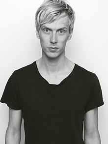
I really like the thought that has gone into this picture, as the sound waves from the record player have merged into the trees. I also like how there is a reflection in the water of the sound waves, as it is ironic to have the sound waves instead of sea waves. The men holding the record and the record player have been edited into this background. The photographer has used dull colours, I think this has been done as it gives a sense of loneliness because of the record player being in the middle of nowhere. Due to this photo being mostly edited you can not tell what type of depth of field has been used or what exposure the original pictures had. |
|
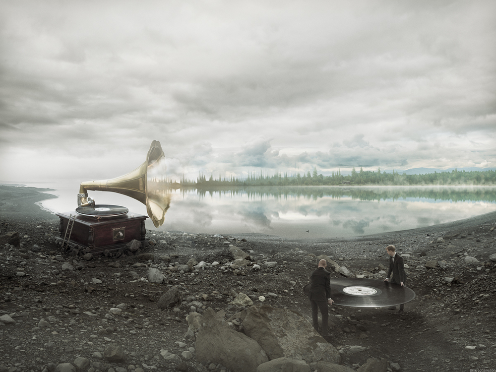
This picture is very realistic however I do not get any message from it, I just see a road that has been pulled up. This picture has been taken from birds eyeview and is perfectly exposed. The photographer has used a medium depth of field as the main focus is on the torn up road. This picture must has also been edited together from different pictures. In my opinion, if this picture had a specific meaning behind it, would be much better. This picture has used the composition of leading lines, as the road starts of normal and leads the viewers focus to the tared up road. |
|
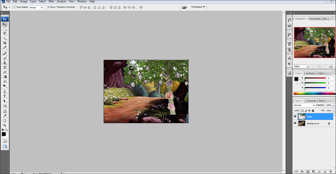
Fantasy - Alice In Wonderland...
Plan - For my first shoot I have decided to have an Alice in Wonderland theme as that relates to being weird and wonderful. I want to take pictures of a variety of things and then edit them all together with a background.
My Props and their use...
A Pocket Watch - I will be taking pictures of the face of the watch and then putting multiples of the pictures in the tree, as though they are growing off the trees.
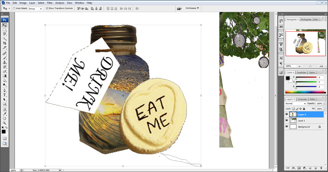
A Sweet - I will be using a Love Heart sweet with 'EAT ME' on it and enlarging it on photoshop.
A Bottle - I will be using a small glass bottle, making a tag for it which will say 'DRINK ME' and on photoshop enlarging it.
The Tree - For this I will be making different signs from the movie and then sticking them on a tree to take pictures of it.
The Flowers - I will be using past pictures of flowers and past pictures from the Portrait unit, then on photoshop give the flower a face.
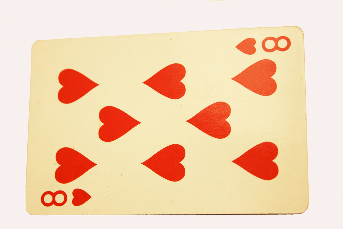
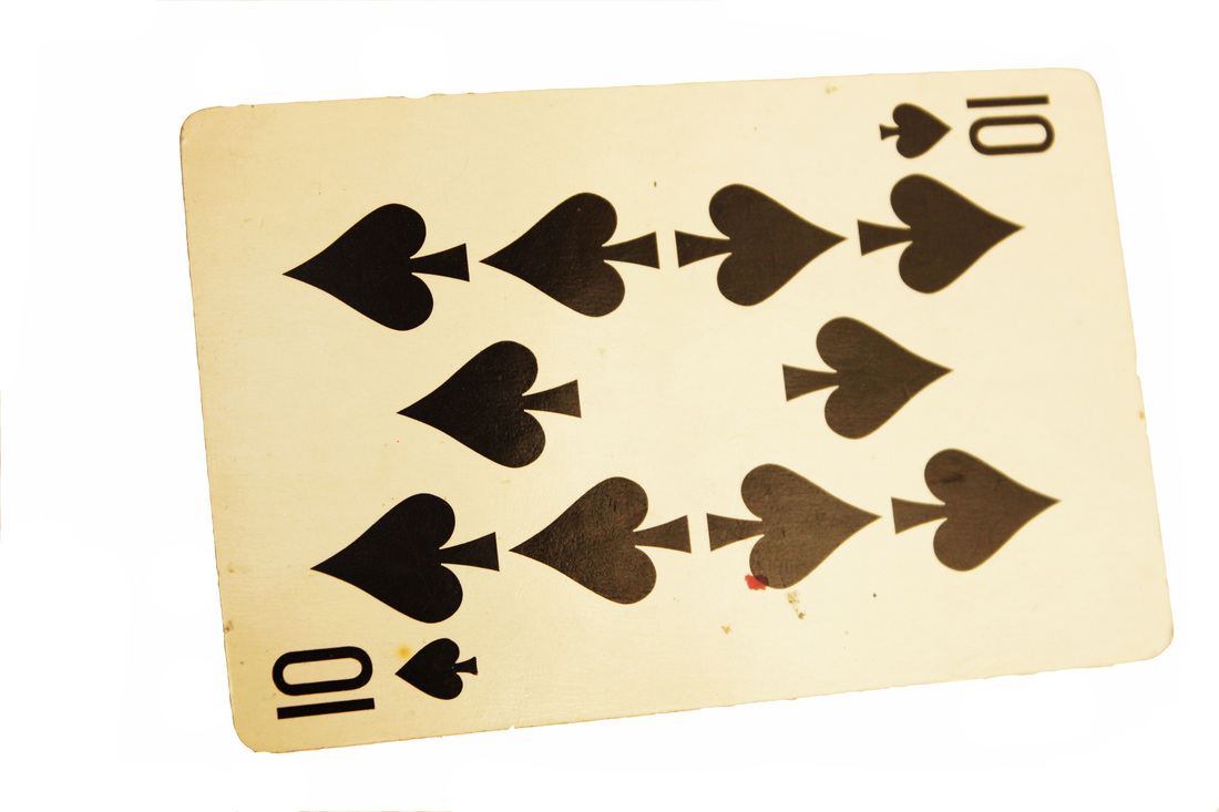
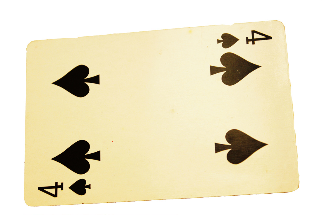
Cards - I will be taking pictures of playing cards at different angles.
The Door - I will be making a small door out of card and then painting it so it looks more realistic.
Below are all the pictures of the different props before being edited or put together:
My Props and their use...
A Pocket Watch - I will be taking pictures of the face of the watch and then putting multiples of the pictures in the tree, as though they are growing off the trees.
A Sweet - I will be using a Love Heart sweet with 'EAT ME' on it and enlarging it on photoshop.
A Bottle - I will be using a small glass bottle, making a tag for it which will say 'DRINK ME' and on photoshop enlarging it.
The Tree - For this I will be making different signs from the movie and then sticking them on a tree to take pictures of it.
The Flowers - I will be using past pictures of flowers and past pictures from the Portrait unit, then on photoshop give the flower a face.
Cards - I will be taking pictures of playing cards at different angles.
The Door - I will be making a small door out of card and then painting it so it looks more realistic.
Below are all the pictures of the different props before being edited or put together:


Worst Pictures...

|
From each invidual shoot this is my worst taken picture as I have used the flash which has reflected of the watch. Also this is sightly over exposed and
looks a little blurred as I would have prefered it to look much crisper. |
Best Pictures...
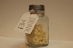
This is one of my best pictures from this shoot as the focus point is set on the label making it stand out. Also the white photo-shoot background worked perfectly, so this picture has a clear white background making it easier to edit. It's exposed perfectly and the white balance had been set to Tungsten, as this picture was taking indoors.
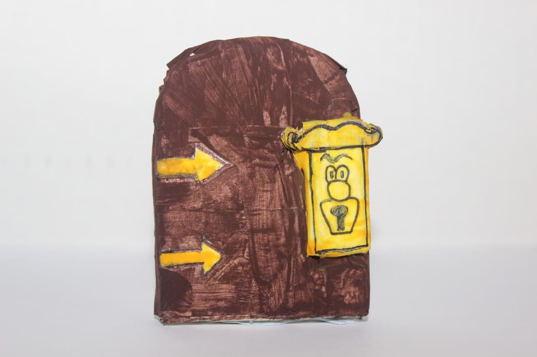
This picture is also one of my best as the depth of field used is small making the door have the main focus whilst the backgroud is sightly blurred. The focus point would be set directly centeral on the door to help capture the detail on the miniture door. It is perfectly exposed and the white balance had been set to Fluorescent.
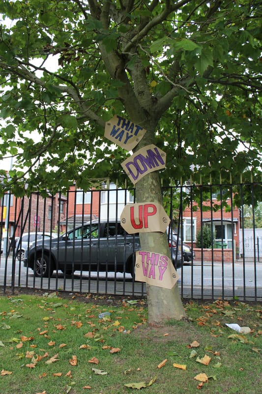
I like the way I have taken this picture as it's been taken from a worms eyeview, as ell as being in focus and perfectly exposed. It's easy to see all of the signs as the focus point has been set on the tree. This has a large depth of field as everything but the slight background is blurred. The white balance has been set to Shade as outside it wasn't a very bright day when the picture was taken.
Editing...
THE FlowerS...
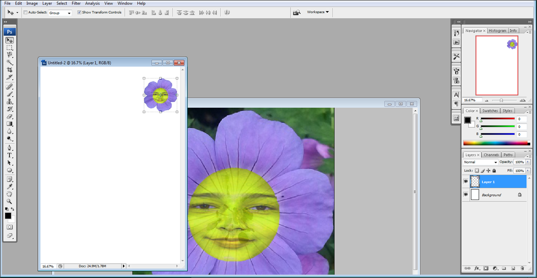
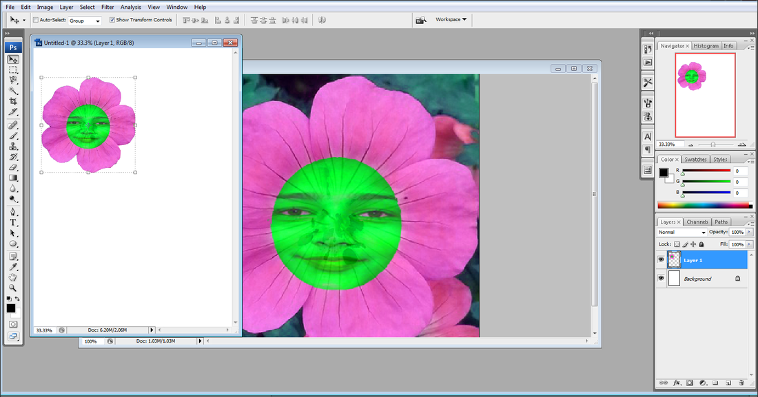
Step 1: Firstly I opened the flower which I took from my Summer portfolio and the girl's photo from my Portrait photography unit.
Step 2: I then cropped round the girl's face as that's what I needed to edit on to the laptop.
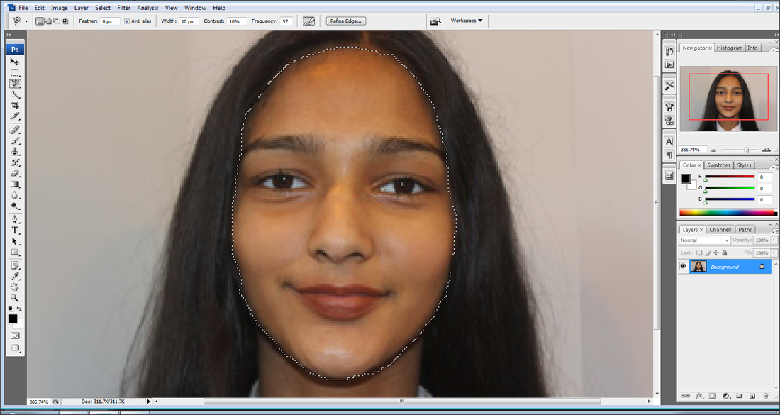
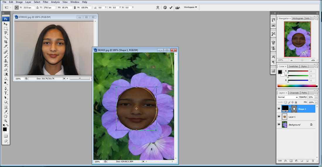
Step 3: I then layered just the girl's face onto the flower picture.
Step 4: Using a circle template over the girl's face I them trimmed around the picture to make it much neater.
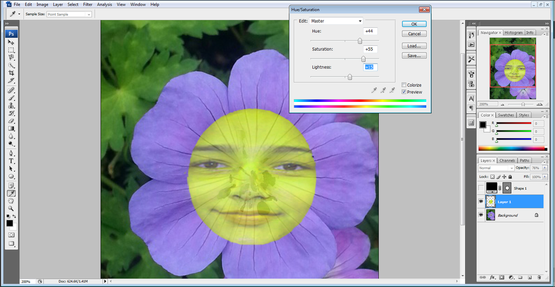
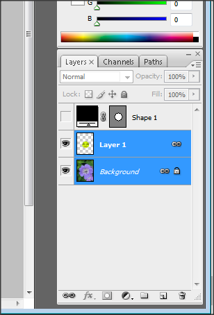
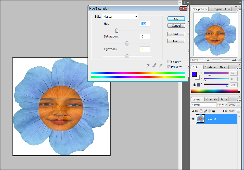
Step 5: Selecting just the layer of the girl's face, I went to 'Image' then 'Adjustments' and using the 'Hue/Saturation' option I then brightened it up and changed it to a bright yellow.
Step 6: Then using both layers I linked them so the coloured face and flower became one picture.
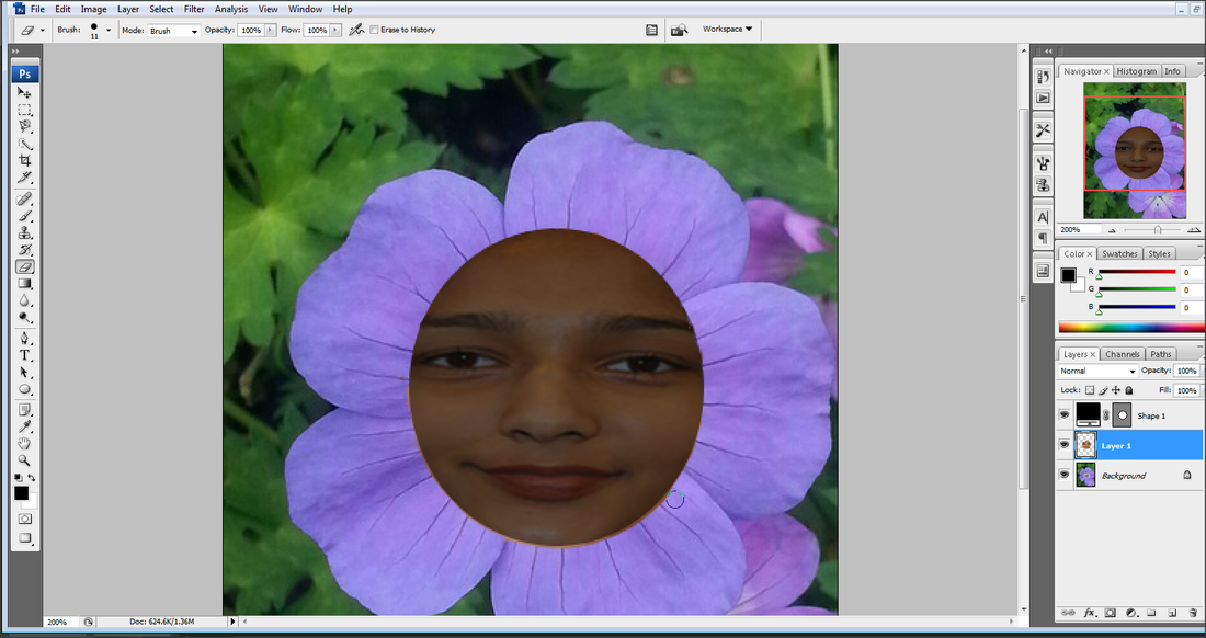
Step 7: Using the magnetic lasso tool, I cut around the flower and mover it onto a white background as it will make it easier to then edit onto the main picture at the end.

Step 8: Using the newly edited picture above I then re-opened it into photoshop.
|
|
Step 9: I then put it on a white background to make it easier to edit onto my main peice at the end.
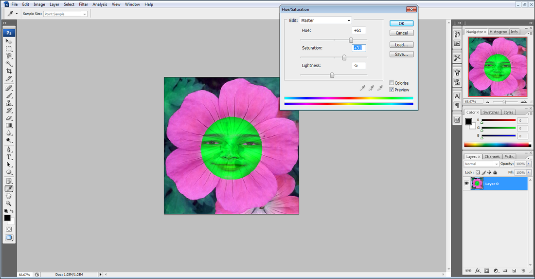
I then reopened this edited flower again in photoshop to change the Hue/Saturation of them to get different colours.

|
|
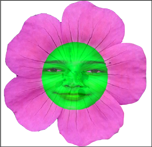
Final Flowers
I decided to make my flowers complementary colours as they clash together, gaining more attention of the viewer. This became beneficial as I was planning to place loads of these flowers all over my final piece.

|

|

|
The Bottle...
Step 1: First I've found the picture of google in which I'd like to be in my bottle.
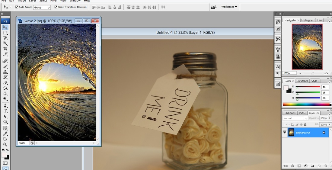
Step 2: Then changing the opacity of that picture I've then put it into place as to where I want it.
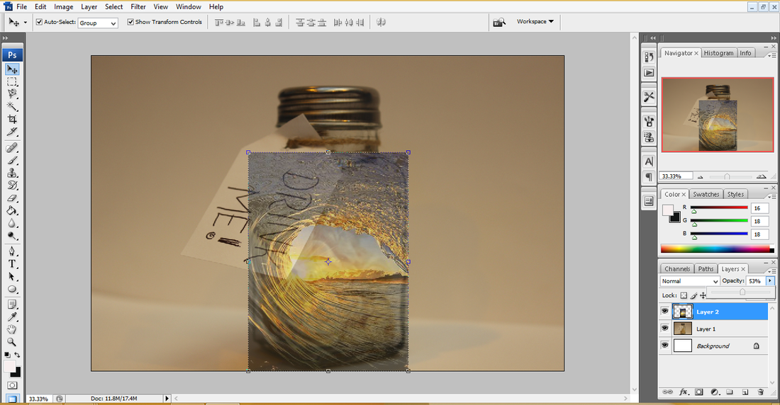
Step 3: Using the magnetic lasso tool I've then cut around the label so the picture isn't covering it.

Step 4: Then I've done the same for around the rest of the bottle.
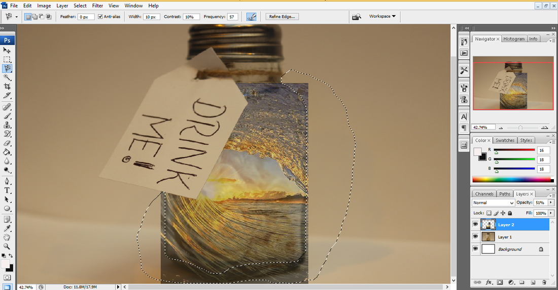
Step 5: Using the smudge tool I've then smudged the edges of the picture so it becomes much smoother and realistic.
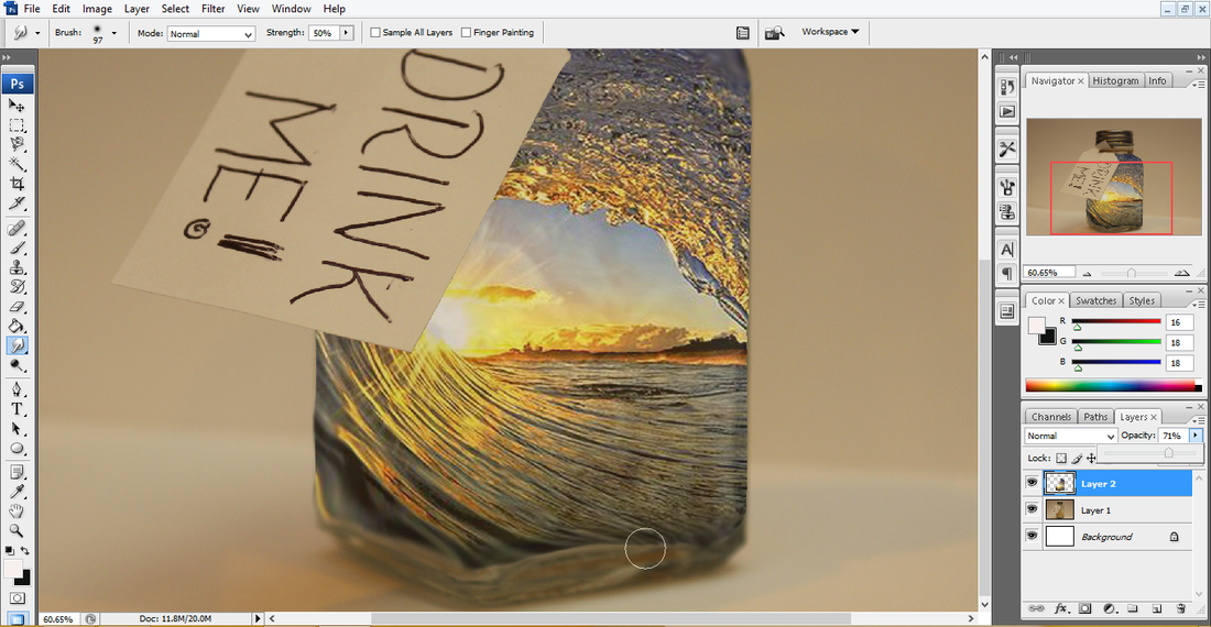
Step 6: To make the label stand out more I cut the label out so it had a pure white background and added some new text.
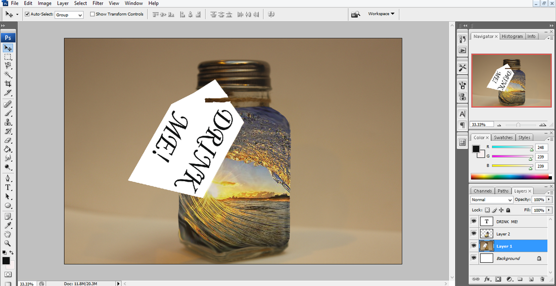
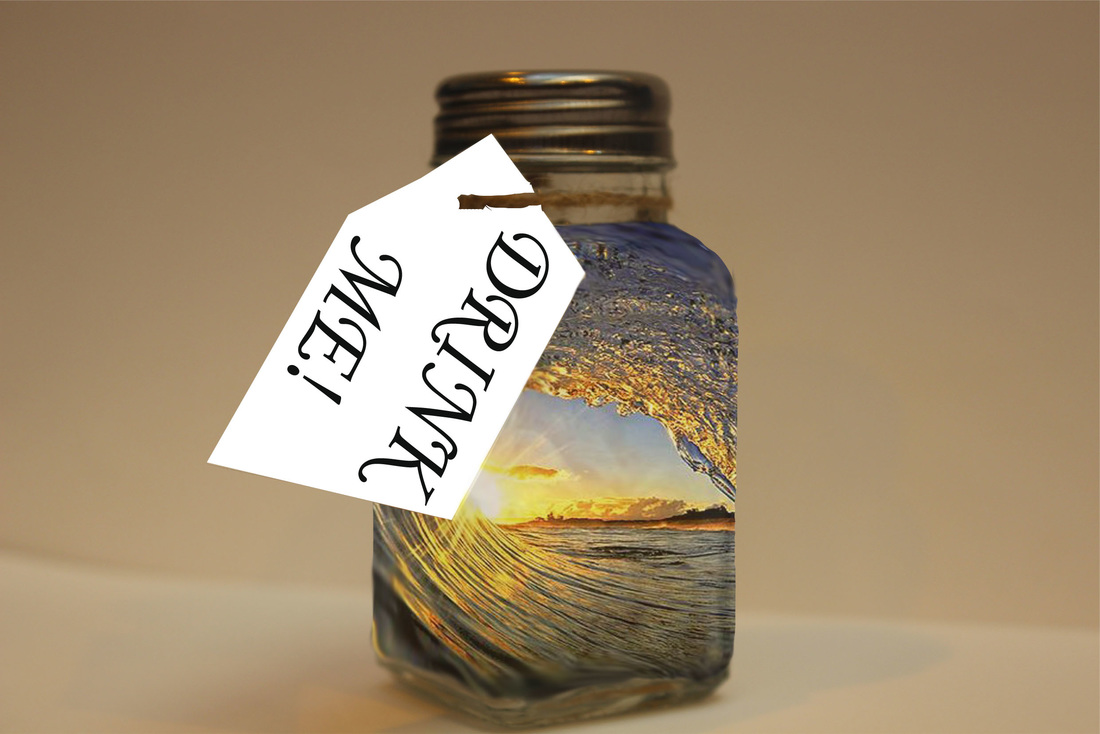
Final Piece...
Adding The Sweet...
I then added the sweet so it looked as though it was leaving on the bottle. I then also changed the brightness of it so it stood out more. Before cutting it out with magnetic lasso tool to put on a clear white background.
Final Piece

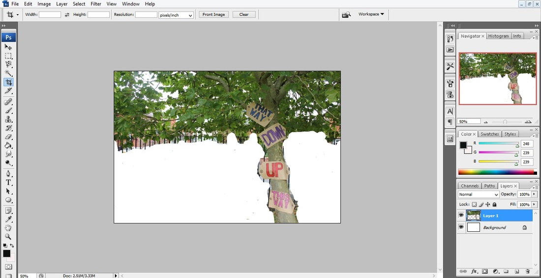
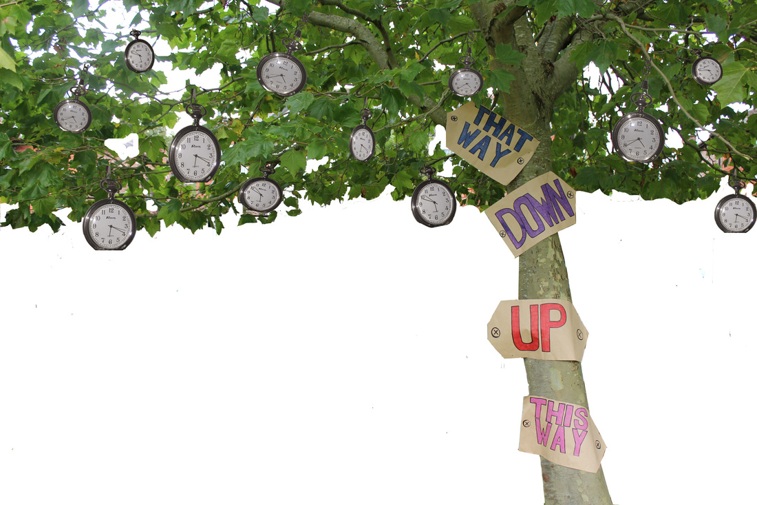
The Tree...
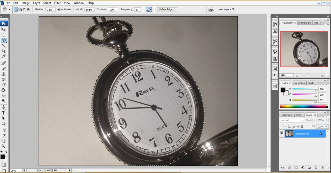
Step 1: Using the magnetic lasso I've cut out the different pictures of the clock.
Step 2: Then I've duplicated the pictures so I've got mulitples of them.
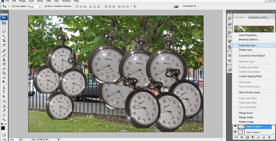
Step 3: I've then placed then into different positons as though they are growing of the tree.
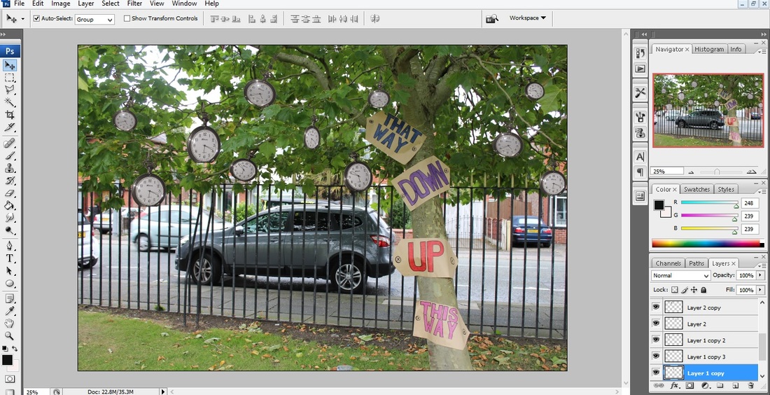
Step 4: Using the magnetic lasso and the rubber I've then got rid of the background, to make it easier to edit onto my main piece at then end.
Final Piece
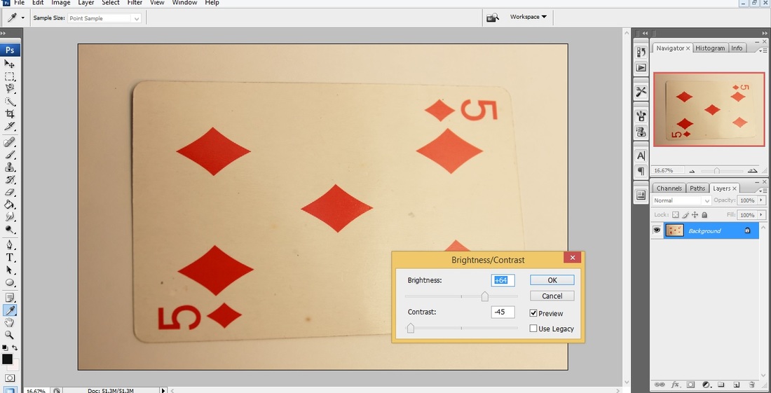
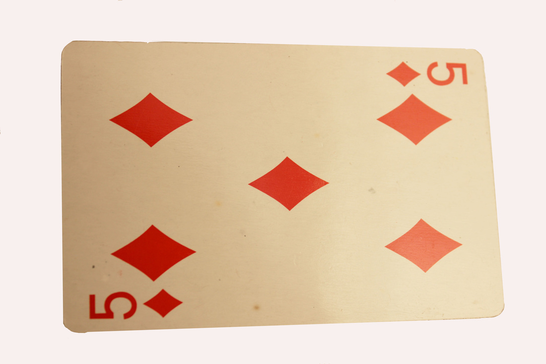
The Cards...
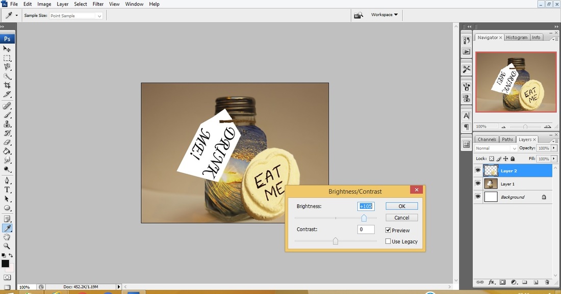
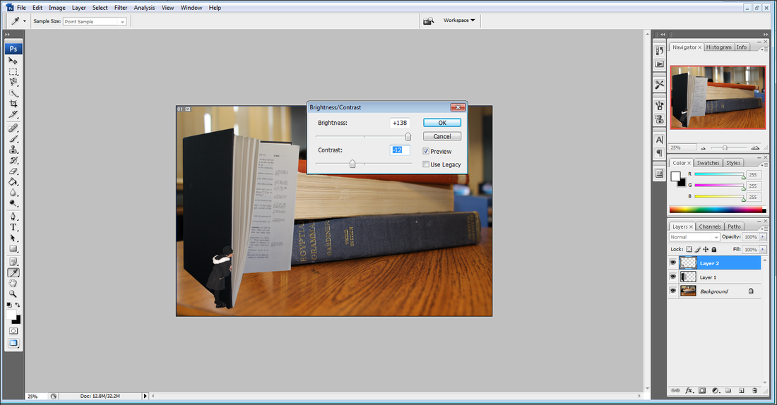
Step 1: Using the Brightness/Contrast tool I got rid of the yellowness and made the colour on them look much bolder.
Final Pieces...

|
|
|
|
attempt 1 - Overall Editing...
Step 1: Firstly, I needed to open all of my final pieces and using the magnetic lasso cut them out off their background.
Step 2: Depending on which picture was needed for what layer I placed them into the spaces in which I wanted them.
Step 3: I had to change the size of them and change the angles they were at depending on where I wanted them.
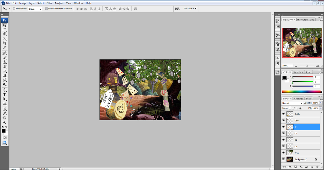
Step 4: After putting the flowers in place I then duplicated them to given them so it looked more realistic as tough them flowers had growen everywhere.
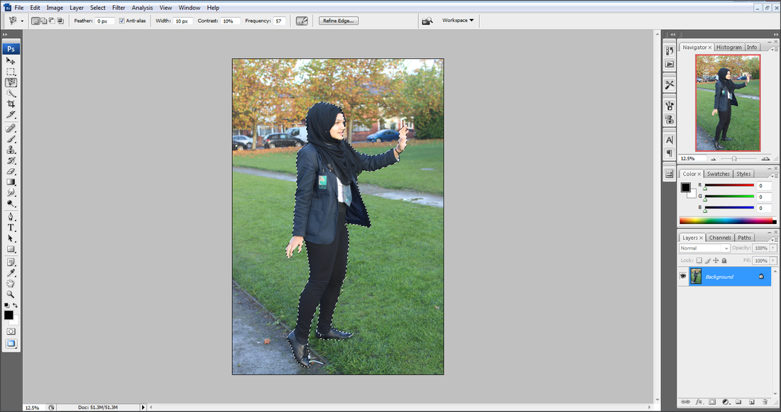
Step 5: I flipped the picture of 'Alice' horizontally as I wanted the her looking down the path.
Step 6: Using the magnetic lasso tool I then cut her out.
1st Attempt - fINAL
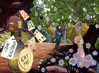
The reason I chose to re-edit this was because due to the background size I had orginally worked on was too small. Therefore I had to make all of my items tiny to place on the background, which has left my picture small which I don't like. So for my 2nd attempt I have chosen a different background to work on, using the exact same steps as above but changed the layout.
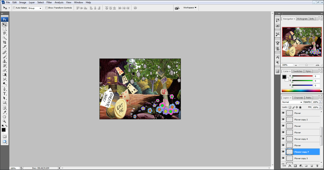
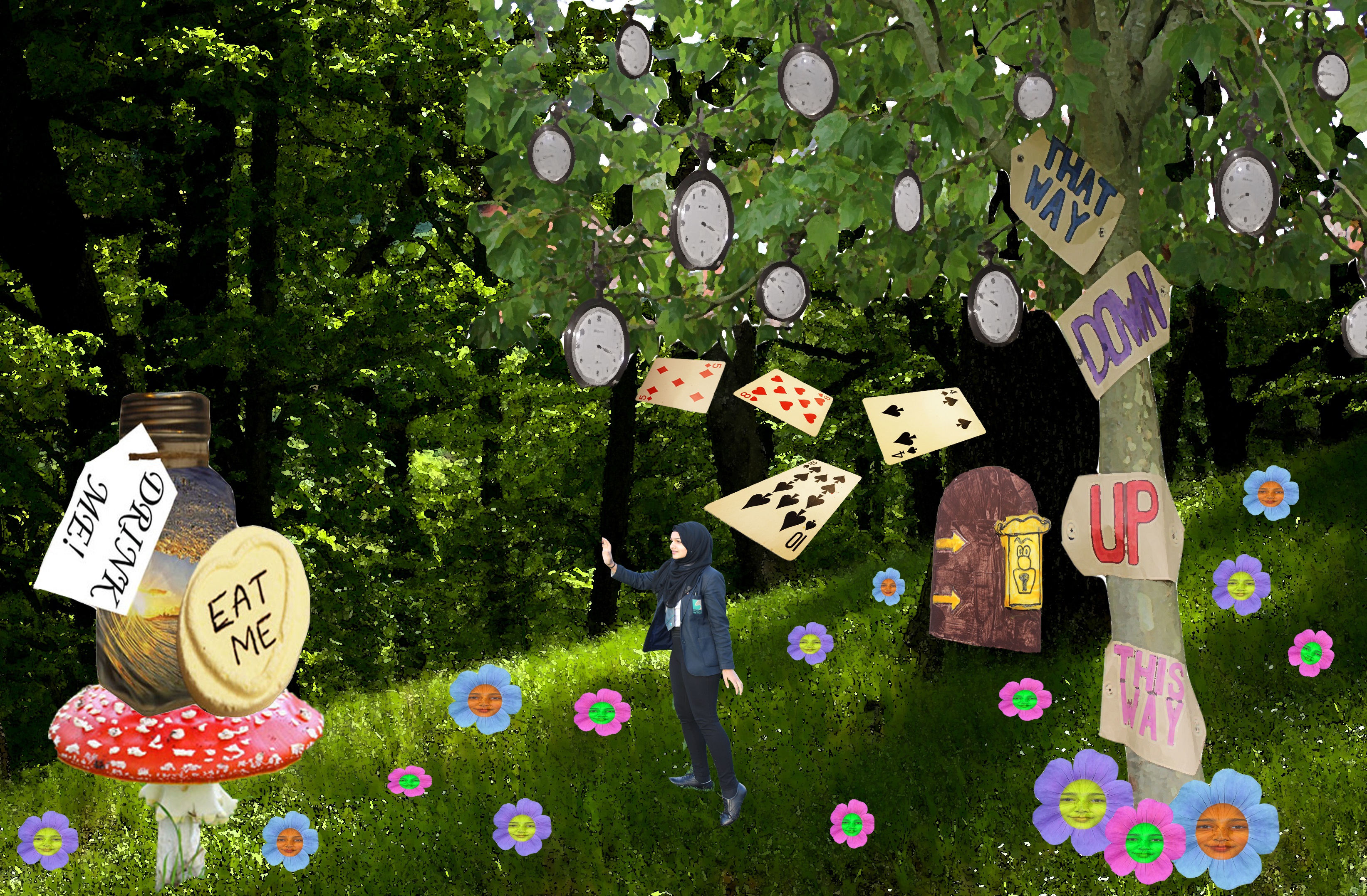
2nd Attempt
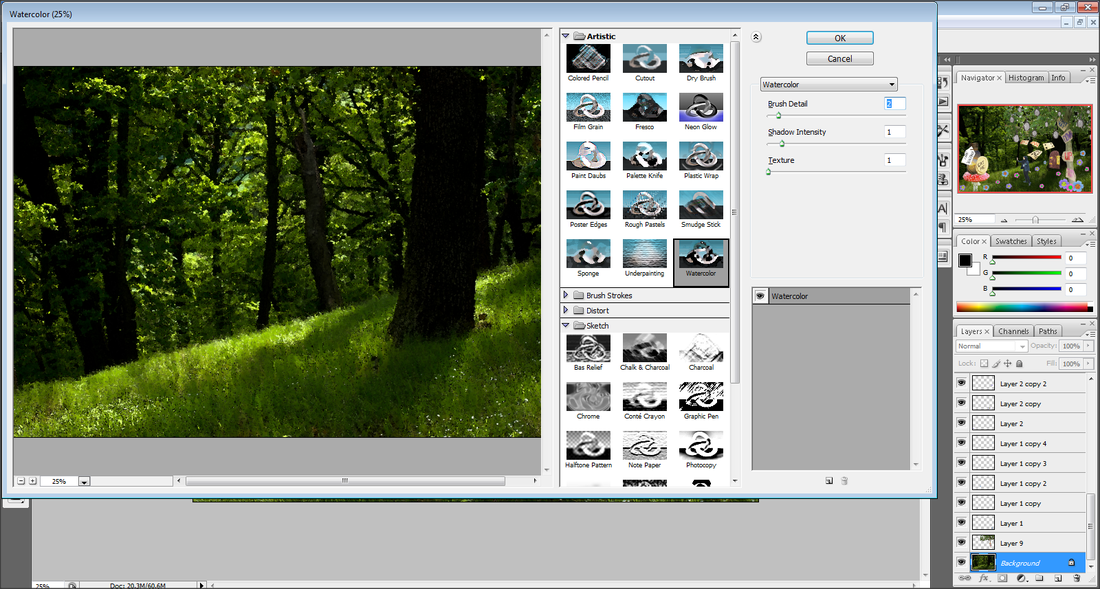
Everything was kept the same but I decided to experiment further so for the tree and the background I chose to put a filter of Watercolour on them. This was to give this picture a more illustrated effect.
final piece
Ben Heine...

|
Ben Heine is a Belgian artist who has produced through the years a huge number of artwork. He is currently best known for his original series "Pencil Vs Camera ", "Digital Circilism " and "Flesh and Acrylic ". He has a degree in Journalism and is a self-taught person in drawing, digital photography and music the piano and drums.
Heine has been interested in painting and drawing since he was a child. He eventually added photography to his repertoire because it empowers him to create images that are more eye-catching, dramatic, precise, and realistic than most paintings or illustrations. His graphic creations have been exhibited widely in Europe and more recently in Asia. |
Here Is some of his work...


|
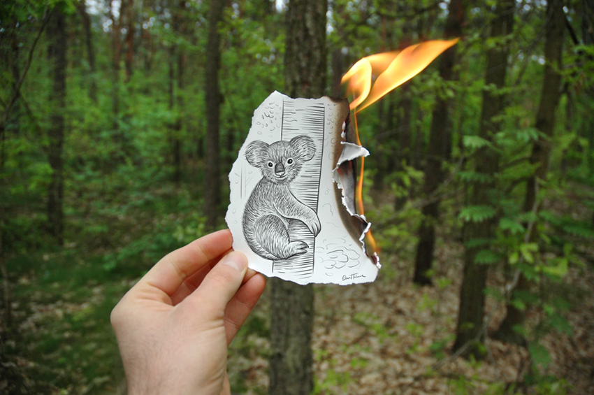
I like this picture as it shows a worldwide problem of deforestation and as a cause of it many animals are being harmed by loosing their habitats. The photographer has used a small depth of field as only the burning picture is in focus whereas the rest of the picture is blurred out. I think this picture is slightly under exposed, to give it an eerie effect to help show darkness still exists in the world. The colours used in this photo is mainly dark making the fire stand out. The photographer has been thoughtful as to where he has held the paper to line up with the tree in the background. |
|
The concept of this picture is really creative and fun, as though a game of tetris is being played but out of the buildings. The photographer has used perspective photography as he has lined the drawn picture up with the suitable background miles away. The focus point would be set on the drawn picture as that stands out more than the rest of the picture. This picture is perfectly exposed and a medium depth of field has been used only the very far ocean is slightly blurred out. The photographer has used the compositional technique of the rule of thirds making the paper the main focus. |

|
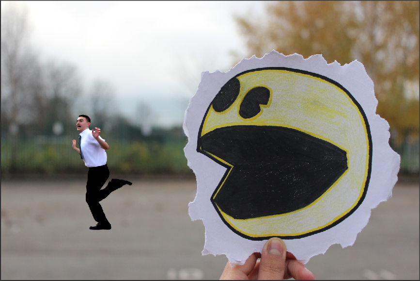
Second Shoot - pAC Man...
Plan-
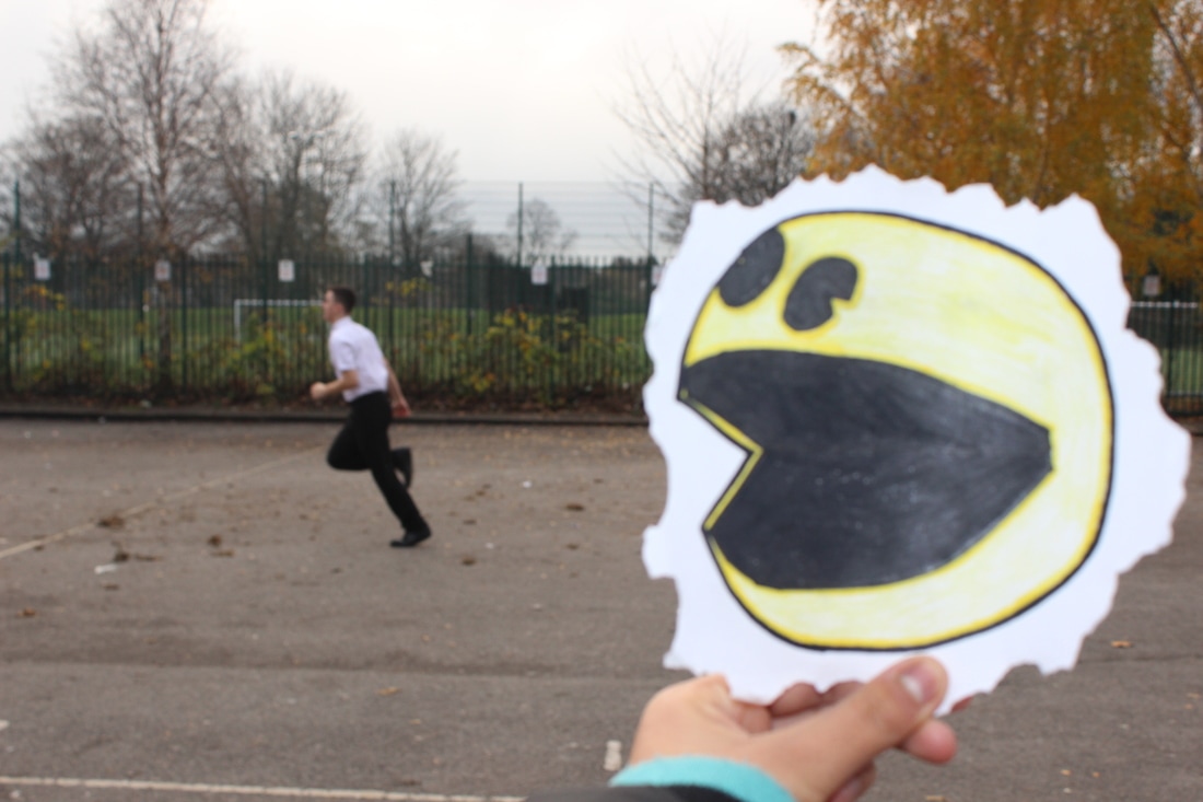
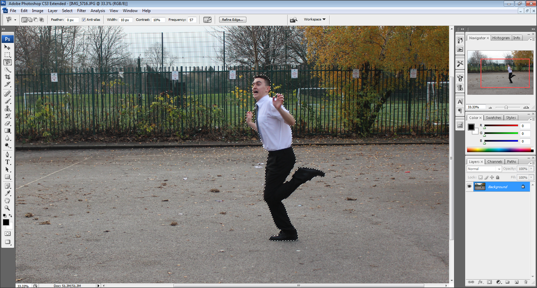
For this shoot I have been inspired by Ben Heine and decided to have Pac Man chasing someone. For this shoot I will be drawing Pac Man and cutting out like Ben Heine does and then outside have someone hold it up to line up with a person running away. This will be perceptive photography as the drawn picture will be closer to the camera whereas the person will be at a distance. Due to taking these pictures outside the white balance will be set to Shaded, I will be using a medium depth of field so the person and Pac Man are in focus and just the background is blurred out.
For this shoot I have been inspired by Ben Heine and decided to have Pac Man chasing someone. For this shoot I will be drawing Pac Man and cutting out like Ben Heine does and then outside have someone hold it up to line up with a person running away. This will be perceptive photography as the drawn picture will be closer to the camera whereas the person will be at a distance. Due to taking these pictures outside the white balance will be set to Shaded, I will be using a medium depth of field so the person and Pac Man are in focus and just the background is blurred out.


Worst Picture...
|
This would be my worse picture of this shoot as it's over exposed and slightly blurred as I should have used sports mode due to the boy running in the background. Also the focus ppoint isn't set correctly hence the reason it's blurred.
|
Best Picture...
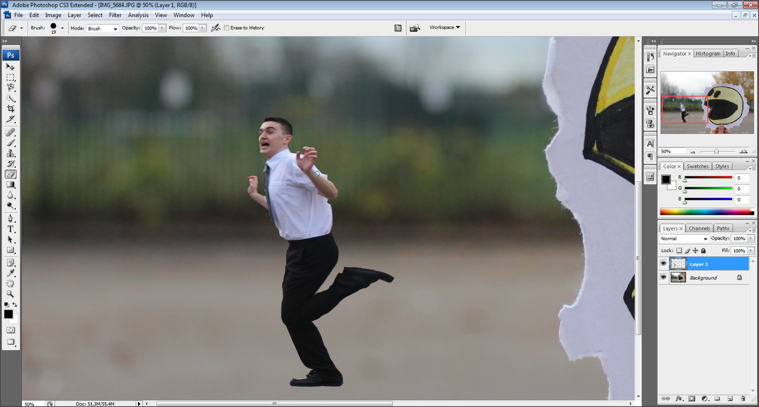
This would be the best picture from this shoot as I have used a small depth of field, as the image of Pac Man is in focus and the background is blurred. The focus point is set on the image of Pac Man making it the main focus of the picture. It has been perfectly exposed as and I like the way that the edges of the picture look crisp and realistic.
Editing...
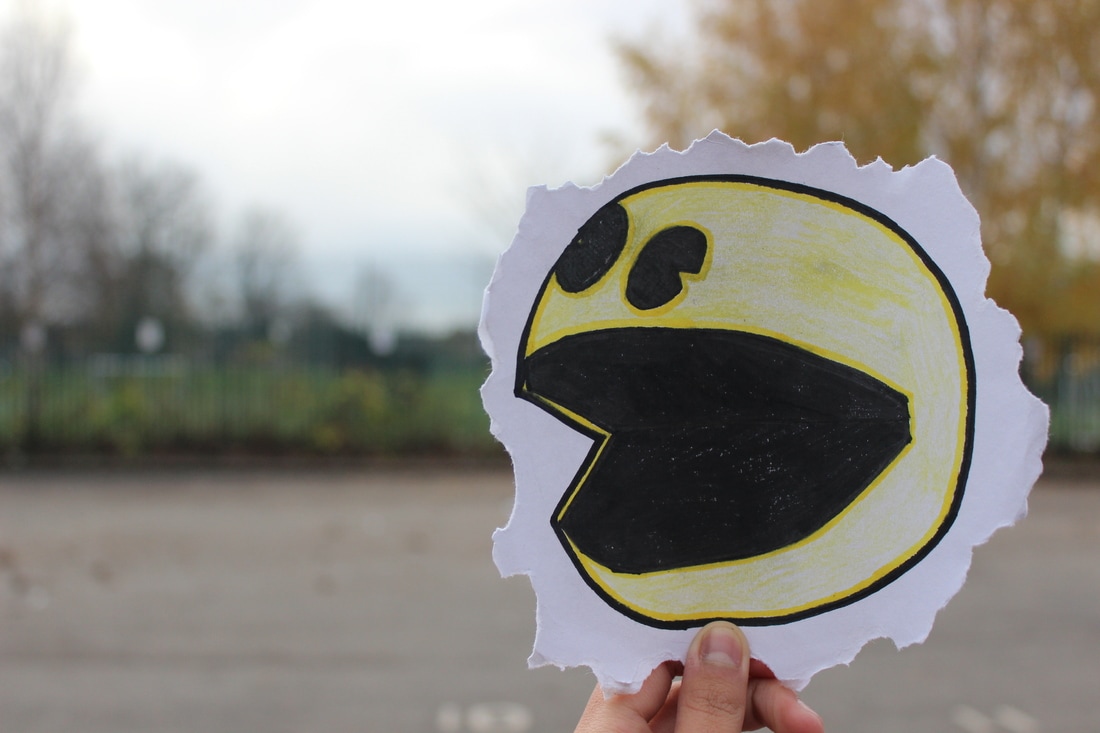
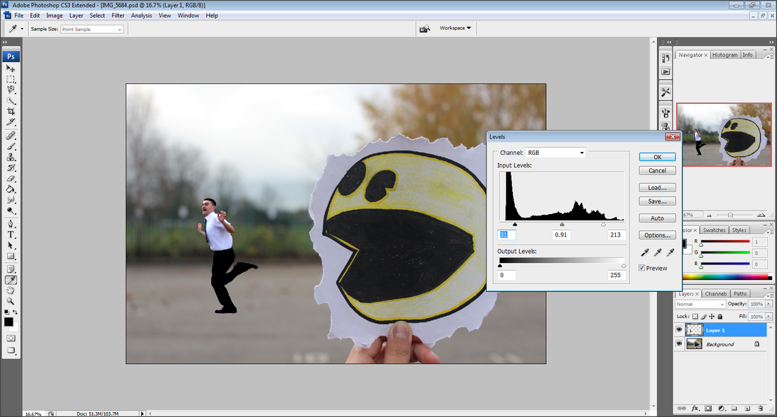
Step 1: First I chose the best Pac-Man picture and the best picture of the boy runnng away.
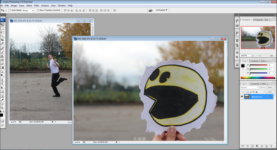
Step 2: Using the magnetic lasso I then cut around the boy to transfer him onto the picture of Pac - Man.
Step 3: Using the rubber tool I've then gave him a much cleaner finish.
Step 4: I then made the boy look much smoother as well as pixelated to make it seem as though he is in a game.
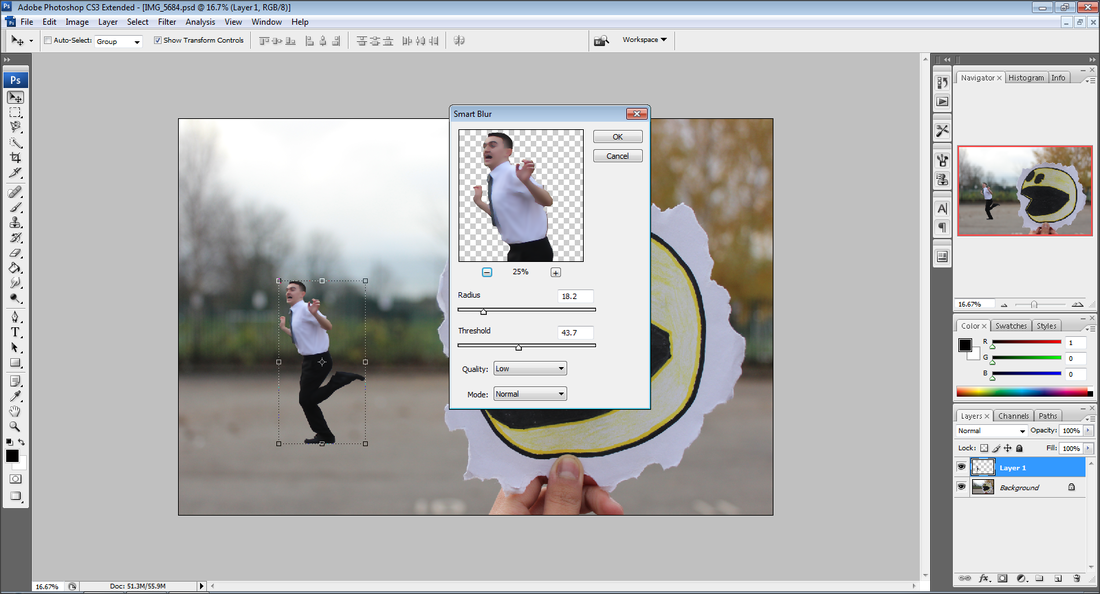
Step 5: I then changed the levels to give it a much nicer tone.
FINAL pIECE

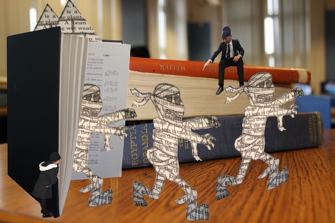
Third Shoot -
Plan:
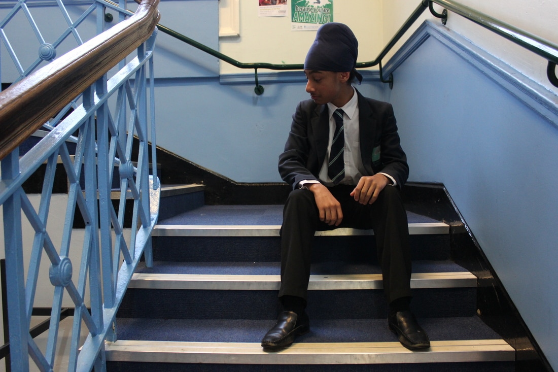
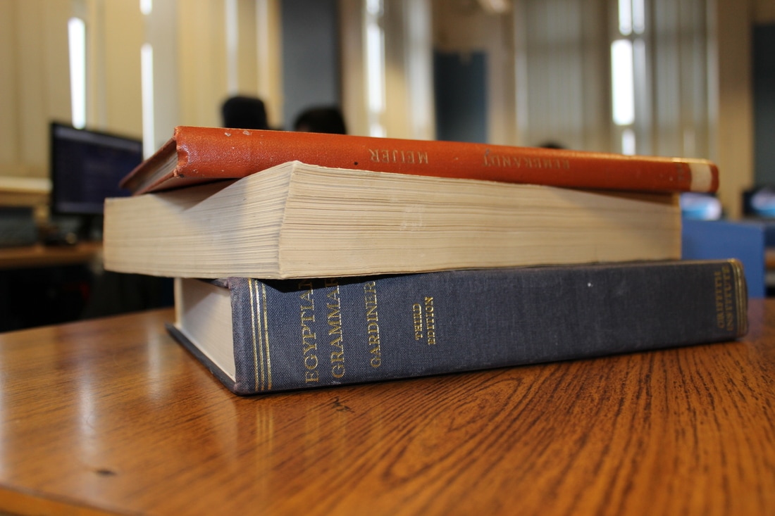
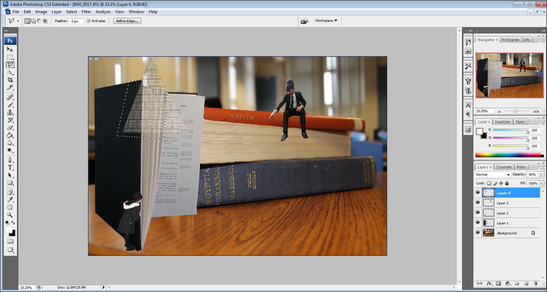
For this shoot I want to create the scene of a book coming alive. For this I am going to take pictures of a variety of objects and then edit them together. Then I will be drawing pictures of mummies and pyramids to then editing coming out of a book. I will have each individual shoot, perfectly exposed with my focus point accurate and as all the objects will be near me then I'll be using a small depth of field, to capture the object fully in focus and the background blurred as it will be editing after.
Here are the pictures from this shoot:


Worst Picture...
|
This picture would be the worse one from this shoot as the model has no expression on his face as I required and it is slightly under exposed. I should have also set my white balance to Tungsten as I was taking this picture inside.
|
Best Picture...
I like this picture as I have used a small depth of field capturing the front of the picture mainly in focus. I also like how the background is slightly blurred. I have used the rule of thirds, which is horizontal in this picture. The exposure is good as the picture is not too dark nor too light.
Editing...
Step 1: I opened all of the best individual pictures from each shoot and then cropped them all using the Magnetic Lasso tool to then place on my final piece.
Step 2: Due to the picture of one of the models blending in with the book, I then changed the Brightness and Contrast of her, so she stood out more against the book.
Step 3: I then placed everything where I wanted it to go, but as I wanted the pyramids to come out of the book, I had to change the opacity whilst I cropped around the unwanted part of them.
Final Piece...
Aarón Gil...
Aaron Gil's idea of using clocks and time in his work is extremely creative. Being able to take something so simple like clocks and giving them a meaning behind it. He uses very dull, neutral colours so a very dull affect is portrayed within his work.


My Favourite:

|
I like how the photographer has used dull, neutral colours to represent the boys mood of how he looks. The message I get from this message is a sense that this boy must be very lonely and whilst he is by himself time is slowing being wasted away. This is represented with the parts of the clock 'flying away', I like how this is done as well as how there is a shadow of them on the floor. There has been the technique of the rule of thirds used. as the boy and clock are on focal points. Also there is a small depth of field which has been used as the further the picture is the less focus is set on it. |
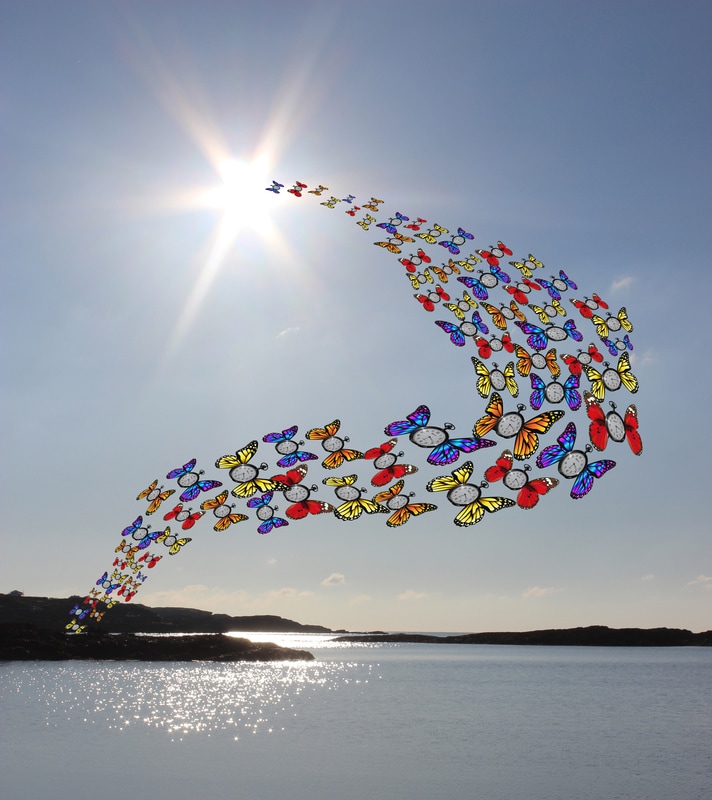
Third Shoot - Time Flies:
Plan:
I plan to use majority of these pictures from previous shoots. My aim will be to get pictures of clocks and using Photoshop put wings on them. Then using a picture from landscape photography I will use it as the background to make it seem as though time is flying away. I will be using a small depth of field when taking a picture of my model as I want them to be as though they are trying to catch the clocked. To do this I will have a net photo shopped into their hands. I want this shoot to seem playful so I'd use bright colours.
I plan to use majority of these pictures from previous shoots. My aim will be to get pictures of clocks and using Photoshop put wings on them. Then using a picture from landscape photography I will use it as the background to make it seem as though time is flying away. I will be using a small depth of field when taking a picture of my model as I want them to be as though they are trying to catch the clocked. To do this I will have a net photo shopped into their hands. I want this shoot to seem playful so I'd use bright colours.
Editing...


After choosing a picture from my Landscape photography I have placed a variety of the butterflies which I have made on Photoshop above at all different sizes and angles to make it realistic.
Final Piece:

Wall of the best...


EVALUATION
Overall this project has been one of the hardest due to needing very different and strange ideas that not only will look good but would also have a meaning behind it. I feel as though Photoshop has made my ideas come to life as everyone of my shoots has had editing done on to it this is what I have improved on during this project mainly. However if I was to redo this project again I would consider different photographers for a variety of different ideas but also to come up with some unique ones myself. Also I could have been able to do more shoots if the first shoot of ‘Alice in Wonderland’ had gone how I had originally expected it to, but since it didn’t I used more time to improve that one. Within this project I have been capable to use Photoshop to a high standard and I have used my photographers as inspiration on multiples of my shoots.
