What Is Architecture photography?
Architectural photography is the photographing of buildings and similar structures that are both exquisite and accurate representations of their subjects.
Margaret Stratton
Margaret Stratton is an American photographer and video artist. Her work in photography has been exhibited at the Smithsonian Institution.


Within Margaret's work she examines buildings that have been abandoned, she believes that theses buildings bare trace of past events that should be remembered and documented. She uses the phrase "a terrible beauty," which hints at violence and loss hence the reason she tends to use black and white. She focuses on elements of the environment, such as deep shadows, light streaming in from nearby windows, or the textures of peeling paint, with a degree of formal elegance. The structures she documents are empty ruins and a number of prisons which some are still in use today.
My Opinion

|
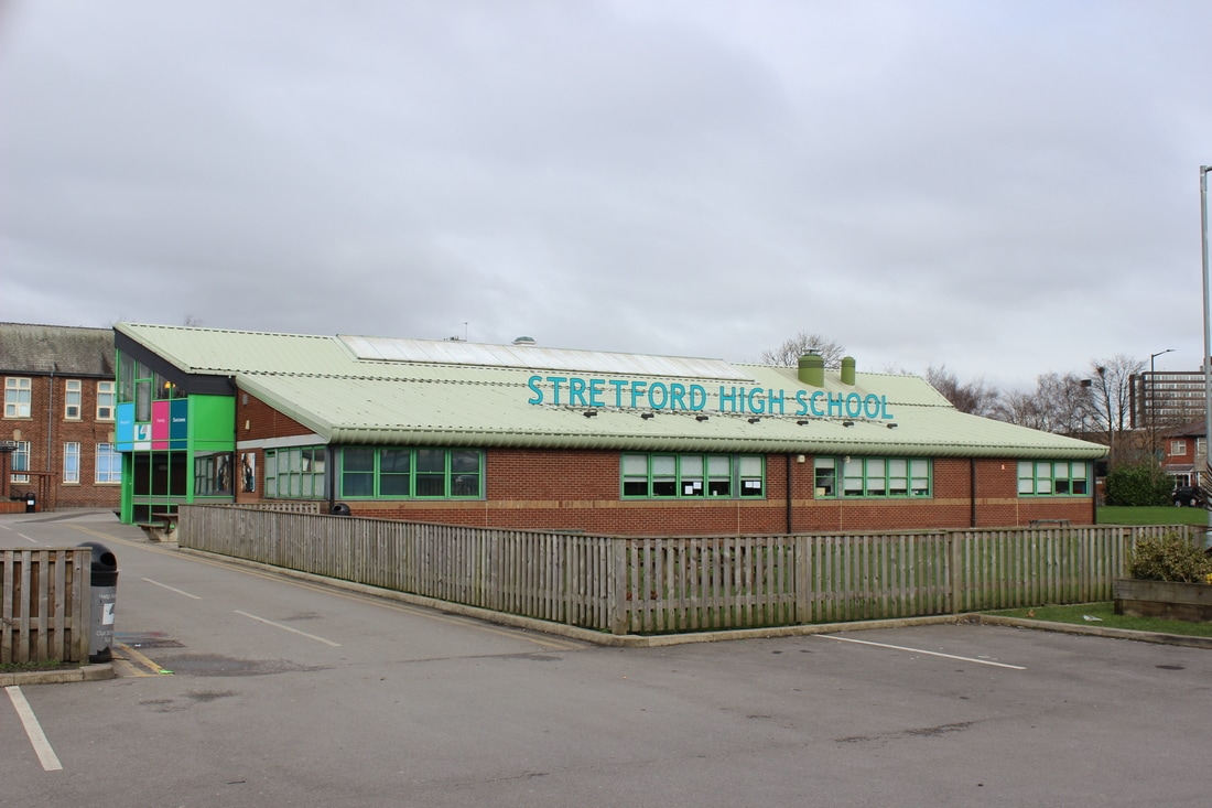
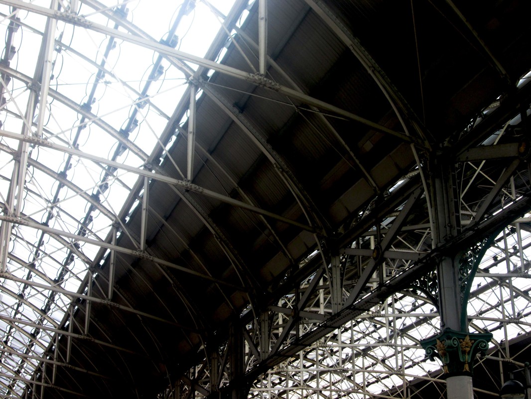
Within this picture she has used the compositional rule of symmetry. She has taken it down a corridor which gives the picture an interesting perspective. I think this picture has been taken slightly from worms eye view, making the arches seem bigger the closer it is and gradually getting smaller. It seems to be deliberately under exposed to give the sense of loneliness and isolation. |
In my opinion, I don't really like her work due to the fact it is in black and white as I am more drawn to colours. However I think the concept behind her pictures are very meaningful.
Candida Höfer
Candida Höfer is a Cologne, Germany based photographer her work is known for it's technical perfection.


Within Candida's work she focuses on waiting rooms at railway stations ranging to diverse spaces such as theatres, museums and libraries. She sees them as cultural icons that we all pass everyday without noticing their beauty. Candida believes that the picture has much more of a meaning if no people are present within it as she is fascinated of the space as it's as though they were once there and have left a meaning behind, as she says "I see my work to some extent as portraits of spaces". She tends to use symmetry to examine the elements of light and structure in a more abstract way.
My Opinion
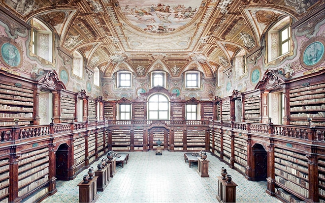
|
Within this picture she has use the compositional rule of symmetry which gives it a creative perspective. There is also a use of the compositional rule of leading lines as due to the barriers on the walls and the empty floor the viewers eyes are instantly drawn towards the far window. I believe this picture to be slightly over exposed to bring out the colour more as well as enforce the multiples of windows around the room. She has taken this picture from birds eye view as the space seems much smaller than it actually would be, I think is so she can capture the majority amount of structure within this picture. She has used a large depth of field to keep everything in focus.
|
In my opinion I really like her work and the use of symmetry. I like how she uses vibrant coloured buildings which brings more meaning to her pictures. The way she doesn't have people in her pictures is also another positive as the viewer can then mainly focus on the structural side of the building instead of the use of it. I like the mood of this picture as even though it's very busy with different colours, the ceiling full of imagery and books covering the walls she can still capture a calm atmosphere.
Berenice Abbott
Berenice Abbott, was an American photographer best known for her black-and-white, scientific photography of New York City architecture and urban design of the 1930s.


Berenice's work consists of her seeing New York's photographic potential. Her work has provided historical chronicle of many now destroyed buildings and neighborhoods in Manhattan. The reason as to why all her work is in black and white is because in the early 1929 colour photography wasn't available, also she tended to only use the facility of her dark room. She avoided the prettier buildings as she favored the thought of 'fantastic' contrast between the old and new buildings. The way she photographed her buildings was with the diligence and attention to detail.
My Opinion
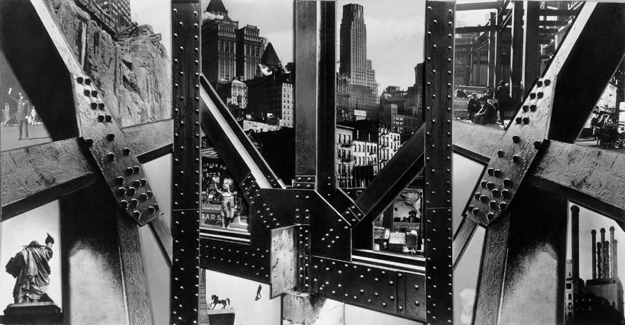
|
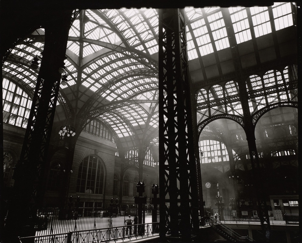
I like this picture as the structure of another building has been used as a compositional rule of framing. Instead of taking the picture from a different angle she has used a hole very discreetly to capture the buildings which are on the other side. She has used a small depth of field as the bars at the front are more in focus than the buildings in the background. Her viewpoint is very perceptive as the front structure is central whereas the buildings seem to be from a worms eye view.
|
In my opinion her work is very different and although it is in black and white I still enjoy it. I like it as she has a very unique perspective of the way she takes her pictures, I will be trying to incorporate within my work.
Ezra Stoller
Ezra Stoller was born in Chicago in 1915, grew up in New York and studied architecture at NYU. As a student, he began photographing buildings, models and sculpture.


Stoller photographed buildings, large and small, inside and out. He created visual narratives, moving in and around the space to describe structure, material and use. Many modern buildings are recognized and remembered by the images Stoller created as he was uniquely able to visualize the formal and spatial aspirations of Modern architecture. Ezra did work in colour on a rare occasion however he primarily shooted in black and white this was because he used a large format camera and it was much easier to take pictures this way.
My Opinion

|
I really like this picture as the way it has been taken from worms eye view has given it a very creative perspective. The compositional rule of lining has been used as the curved lines lead the viewers eyes toward the window after flowing the spiral effect as well as the window being upon focal points within the rule of thirds. The lighting has been done effectively and efficiently this is because the further from the window the darker it becomes. A large depth of field has been used as the closer to the window the more sharper it becomes as it's the main focus. In my opinion I feel that the angle of worms eye view I will try to obtain within my own work as I have come to the result of how creative this angle and be within a picture. I am also going to try focusing on buildings with interesting structures as well as the windows of buildings. |
SHARON TENENBAUM
As a Photographer, Sharon is a self-taught artist, having learned her craft through personal research and practical experience behind the camera. Although an artist at heart, Sharon enjoys teaching and sharing with others her photography techniques and vision.


Within her work she incorporates a Long Exposure technique to expand the expressive dimensions of her art. This is because her passion for photography started with street photojournalism, yet combined with her original background as a Civil Engineer, her work covers a wide gamut of subject matter from ‘in the moment’ Photojournalism to Fine Art Architectural Photography which is a perfect marriage of her engineering and artistic sides.
My Opinion

|
There has been a compositional triangle due to the position of the bridge. I really like how she has used the contrast of a black and white background with the bridge in a bright colour. Also another compositional rule of symmetry has been used. The angle of this picture has been taken is from a worms eye view, and I like the perspective of how you can look down the bridge and it goes into the distance. In my opinion I like how she uses very subtle colours which gives it a much realistic finish. Therefore in my work I will be using these colours so my pictures have a calm and realistic finish. |
Victor Enrich
Victor Enrich is a Catalan photographer, who explores architecture whilst manipulating it to become architectural illusions by changing their structural features.


It is explained on his website as to why he works in this manor, "Enrich sets himself the duty to witness the gravity of the urban soul while it changes from an understood shape into an intellectual experiment, always through a permeable decay towards the assumption of the volume, expelling newborn shapes as if they were already elderly.”
My Opinion
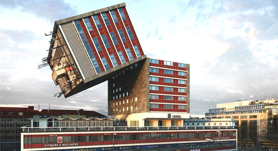
|
I really like how he edits the pictures to make them seem very surreal. The colours and backgrounds he has used are very normal and realistic which contrasts nicely with the editing. The way that it has been edited surreal like is what draws the viewers attention into it. |
Ideas...

Test Shoot:
The point of this shoot was to use what is around me to test out different ideas before doing my shoots on much modern buildings around Manchester. I am going to practice the following techniques: angles, viewpoints, compositional rules, exposure and depth of field.


After doing this shoot I have found what is effective to make my pictures of architecture stand out. Firstly I think the viewpoint of worms eye view works really well as the perspective of the building becomes different and creative. So when doing my real shoots I will be taking majority of my pictures from low down. Also I feel as though the compositional technique of framing and leading lines particularly give the picture a interesting composition.
First Shoot:
For this shoot I plan to go into Manchester town and using the feedback from my practice shoot I am going to use them techniques to take pictures of the exterior of different buildings. I am going to mainly focus on taking the pictures from worms eye view as I feel this perspective gives the building a fascinating affect as well as being able to capture the whole building. I will be taking a mixture of older and newer buildings, this is so I can then come familiar as to which type I prefer. I will also be looking at the windows of the buildings, from different angles. I will be focusing on the overall structure than minor detail at this stage. I want try putting different compositional rules into use, such as the rule of thirds and compositional triangles.
Here is what I was able to capture:
Here is what I was able to capture:


Editing:
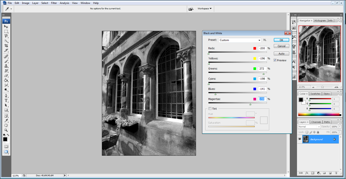
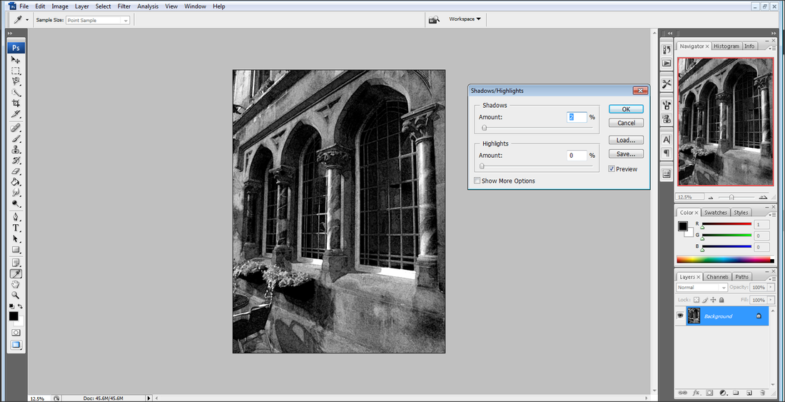
Step 1: Firstly I customized the black and white filter.
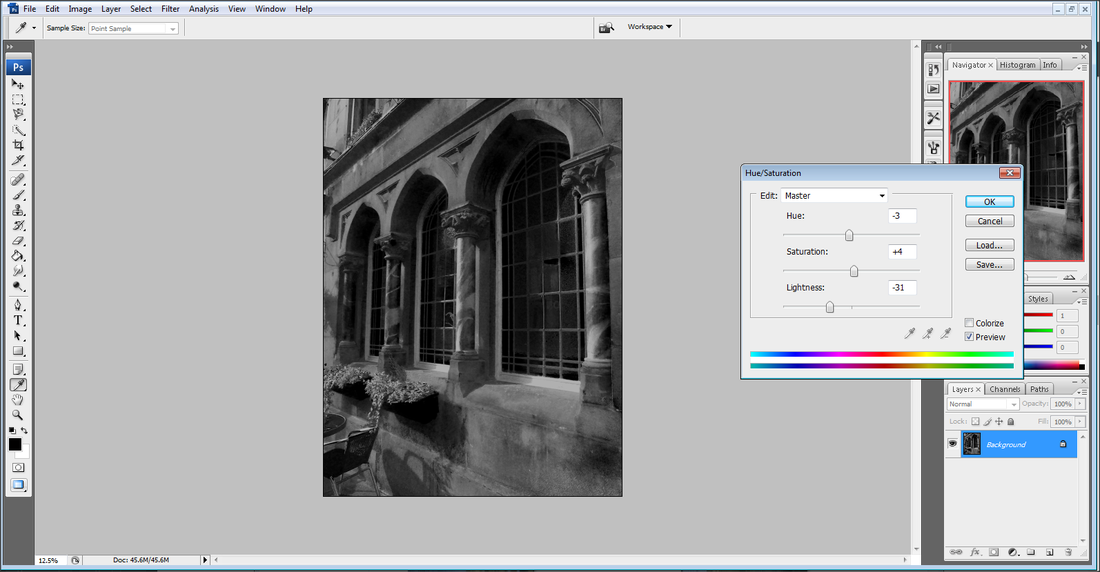
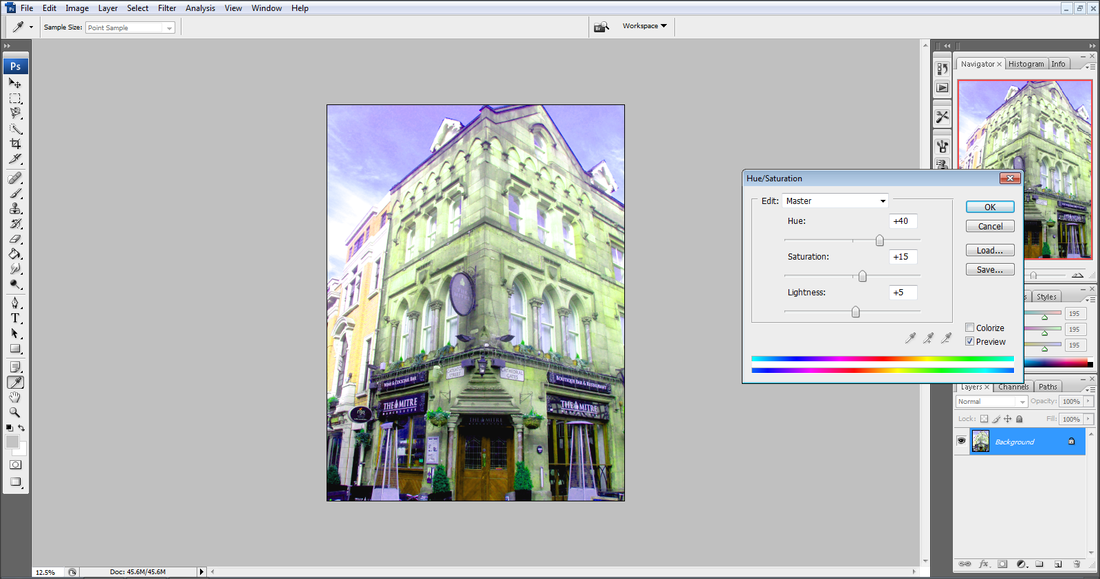
Step 2: Then I have changed the lightness within the Hue/Saturation.
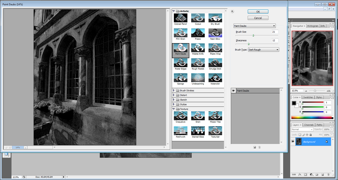
Step 3: I have then gave it a more drawing/painting look, to make it seem much older.
Step 4: Finally I have changed the shadows/highlights within this picture.
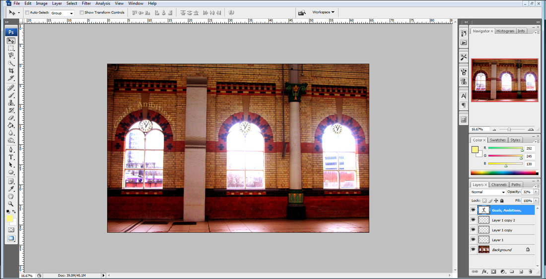
Final Piece
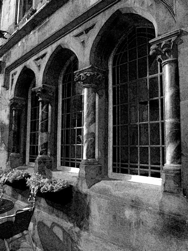
Comparison

|
I have edited and worked in the style of Margaret Stratton, however I have slightly changed the style as instead of using arch ways I have used windows which are arch shaped but I have still incorporated the pillars. I have also made my work seem more artistic than a realistic photograph. I have made sure I have not captured any people within it, like Margaret this creates the isolated effect. After working in her style I have decided to now experiment further with colours as I prefer colour than black and white work. |
EDITING (2):
Step 1: Using colour match I tried to make my photograph much lighter and experimented with it until I was happy.
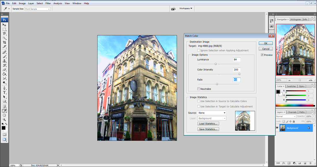
Step 2: I then used the levels to make it go from lighter to darker as you reached to the bottom of my photograph.
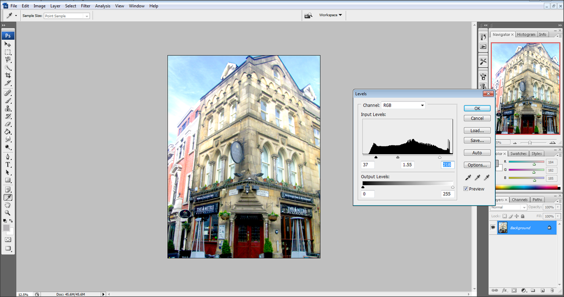
Step 3: I then used the hue/saturation to make the colours them more vibrant.
FINAL PIECE
COMPARISON
I would compare my work stylistically to Candida Höfer, as I have gone for a dream like affect with the light colours. I have also incorporated the compositional rule of symmetry. However instead of copying Candida's work exactly I have decided to focus on the exterior than the interior.
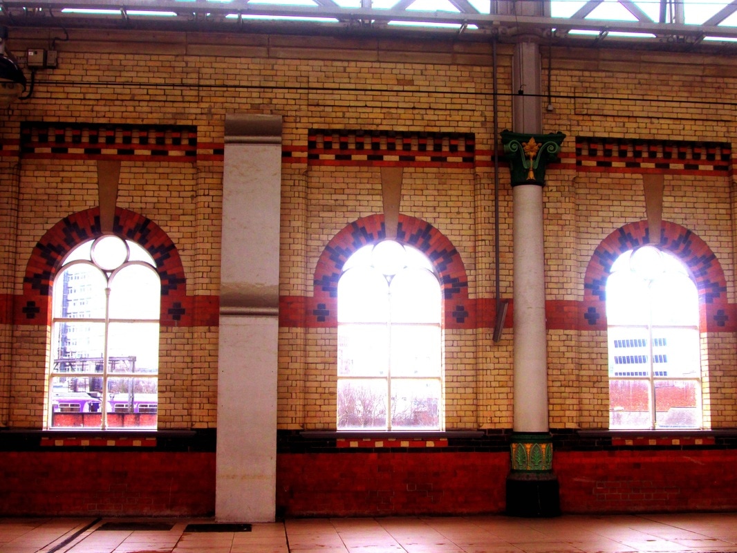
Second Shoot:
When going out on the weekends I was able to capture different buildings which looked appealing. This included Cheshire Oaks shopping area, Salford Quays and other buildings around Manchester.


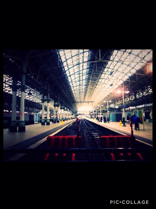
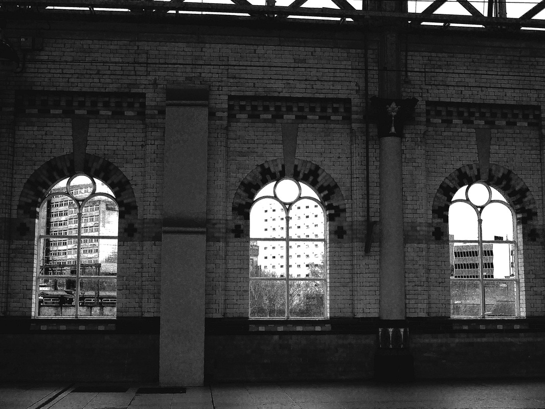
Third Shoot
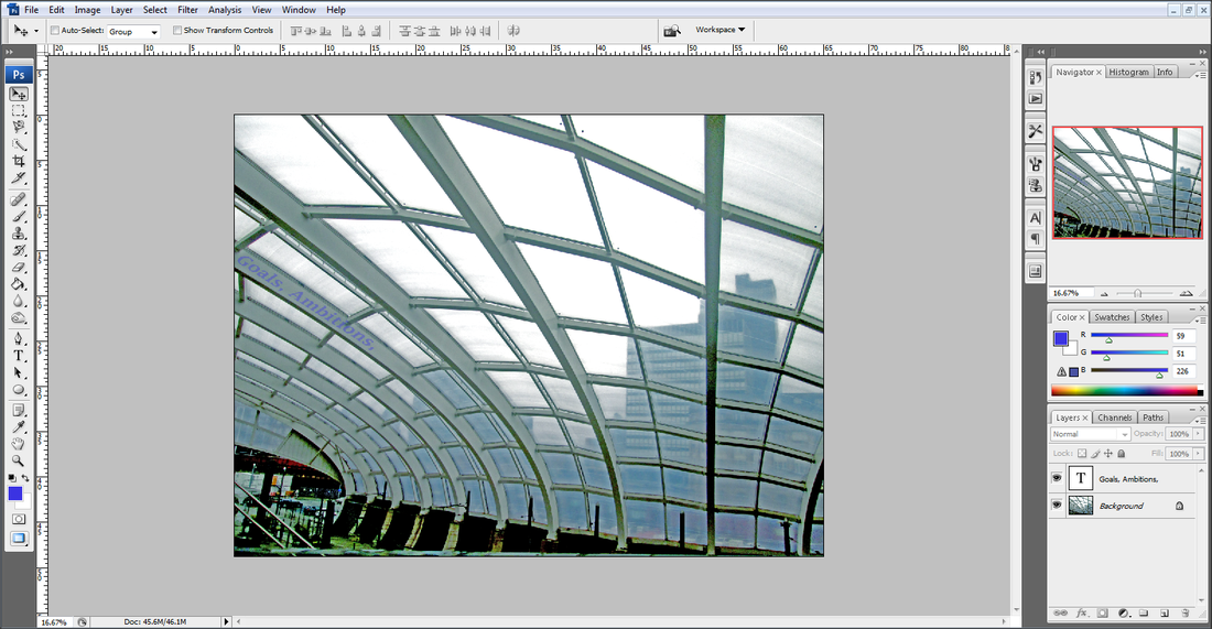
I went to the two local train stations near me, Piccadilly and Victoria Train Station. This was inspired by Berenice Abbott as well as wanting to capture the interior architecture as well as the exterior.


Editing:
I used the app Pic Collage on the iPad to use different filters and adjustments to create a romantic and dreamy atmosphere. This was to try combining the works of Candida Höfer with a dream like effect and Berenice Abbott with her work of the train stations.

|

|
|
|
Final Piece:
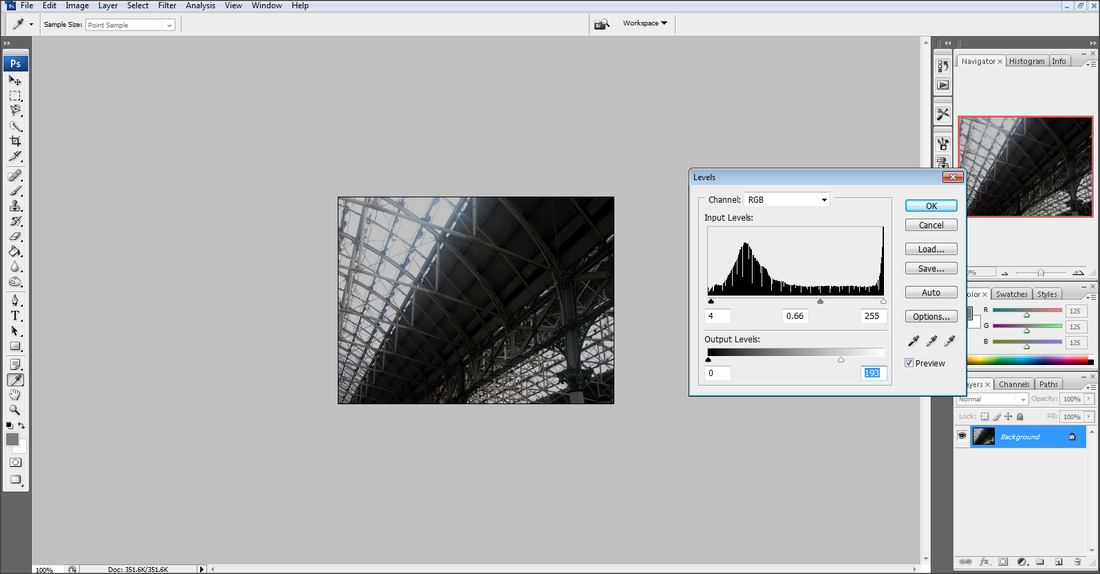
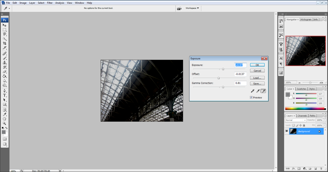
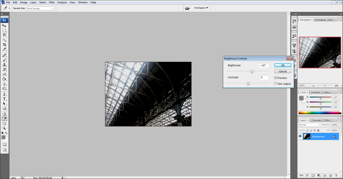
EDITING (2):
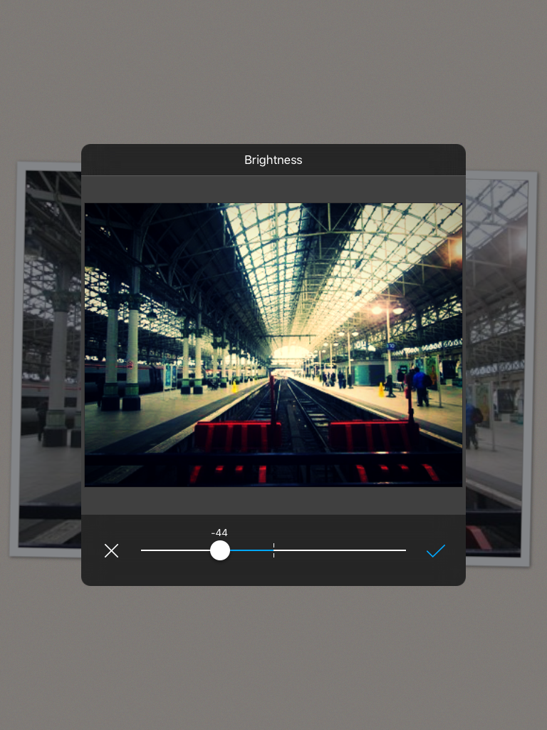
Step 1: I had adjusted the levels of the picture to give a more dark atmosphere.
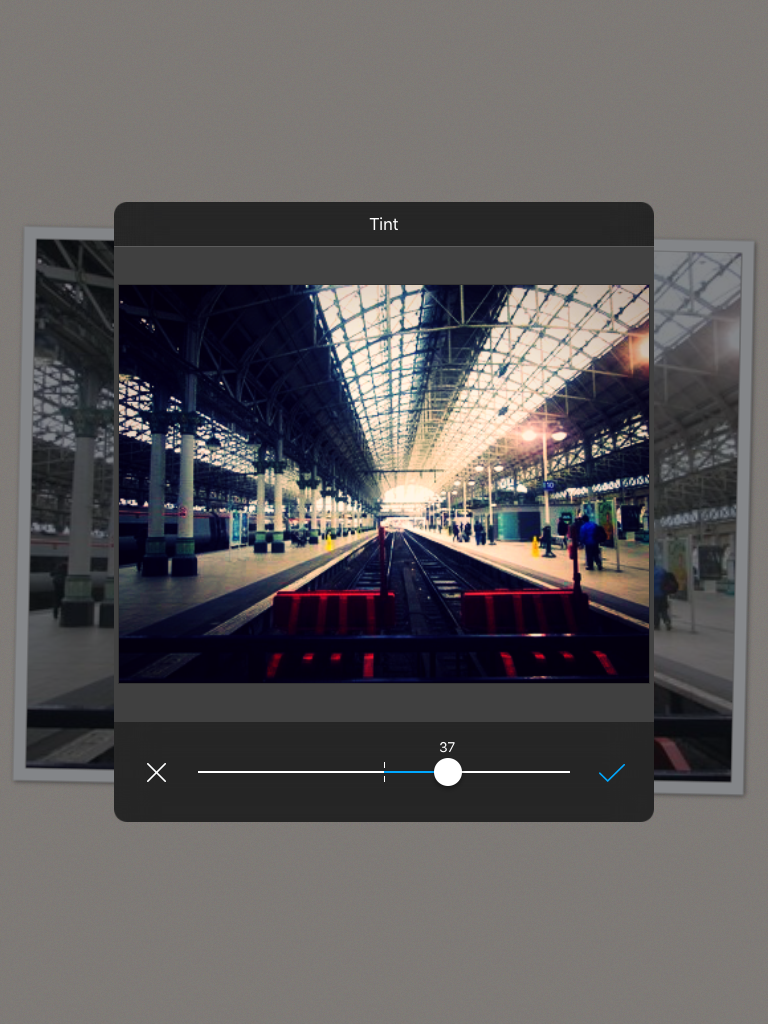
Step 2: The exposure and offset was then changed this was so the window section seemed lighter where as the railings had a much darker look.
Step 3: The brightness was then made brighter this was so you could make out the railings were still there.
Final Piece...
COMPARISON
|
I have used Berenice Abbott as inspiration to take pictures of train stations as well as editing them in this way. The black and white filter can represent the misery of people leaving one another to go on journeys away from loved ones. However the bright sky light coming in from the windows can represent how people go to train stations to go on adventure or starting a new chapter within life. |
EXPERIMENTING EDITS...
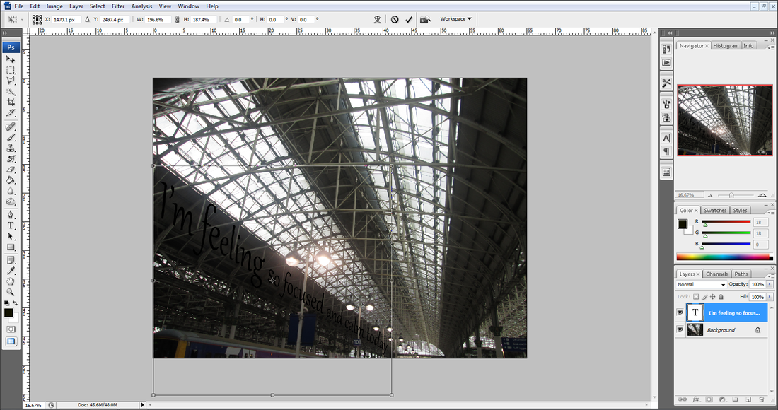
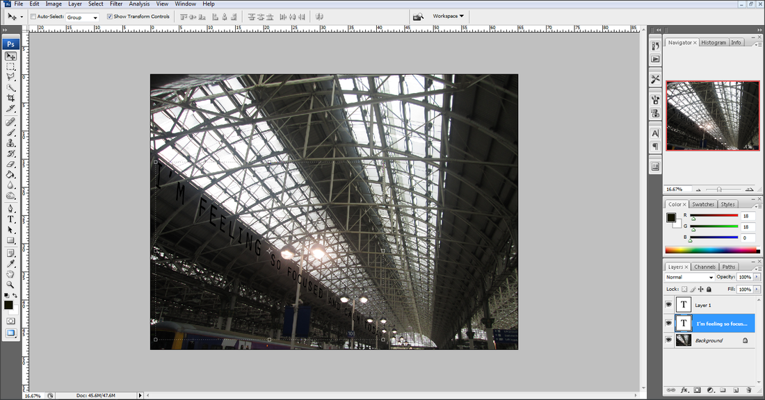
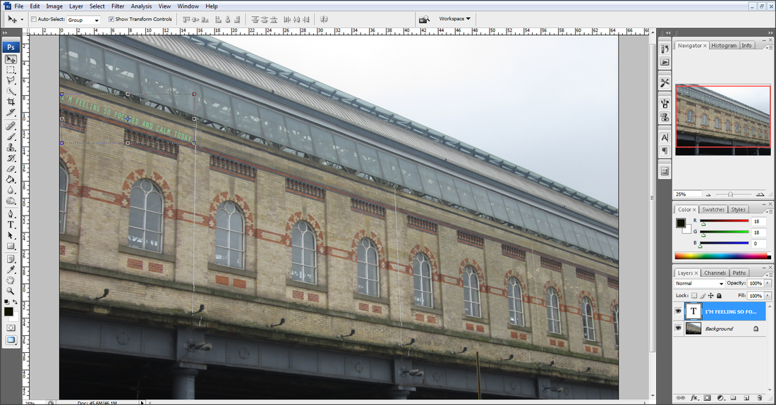
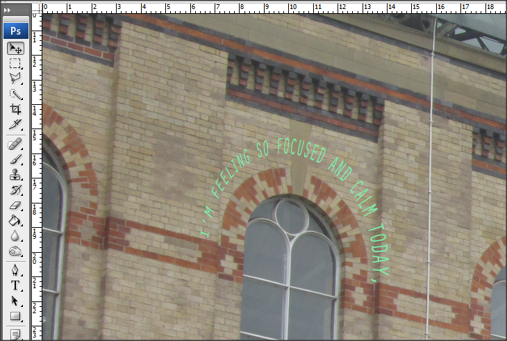
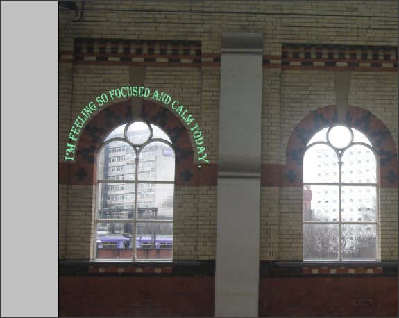
I then explored further and decided to incorporate text within my work, this is so I could give more of a meaning behind my pictures.


Exam PREPARATION
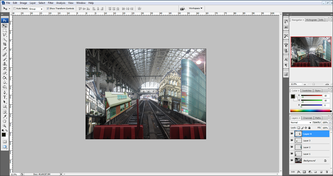
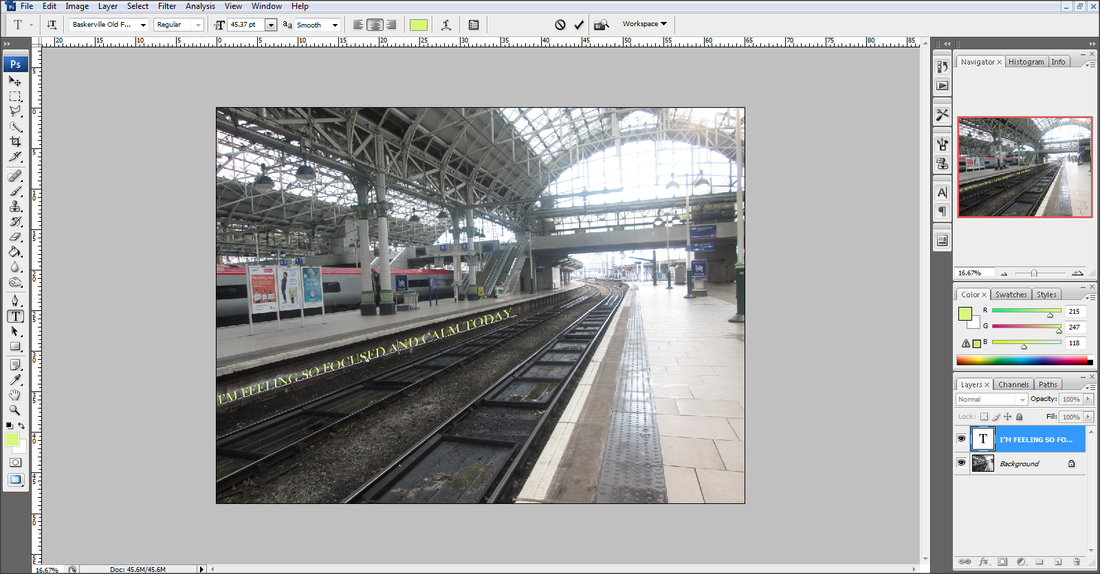
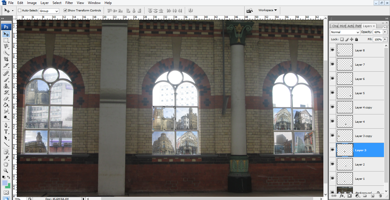
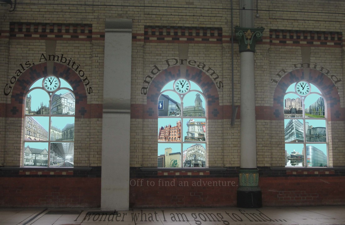
For my exam I have decided to create a multiple of final images to represent a poem/story of journeys. I have used the architecture around Manchester which have been built over different periods of times and split them into different groups of History, Modern and Contemporary. This is so in each window I will have a different building depending on the timeline of when they were built. I have also decided to develop my text idea further and make it apart of my final piece, this will be done through a poem I have wrote myself. Furthermore I have linked my whole project to the theme of Journeys this is the reason and purpose behind my poem as well as using the train station as the background and main focus of my final piece.
Exam Work
My Editing Process:
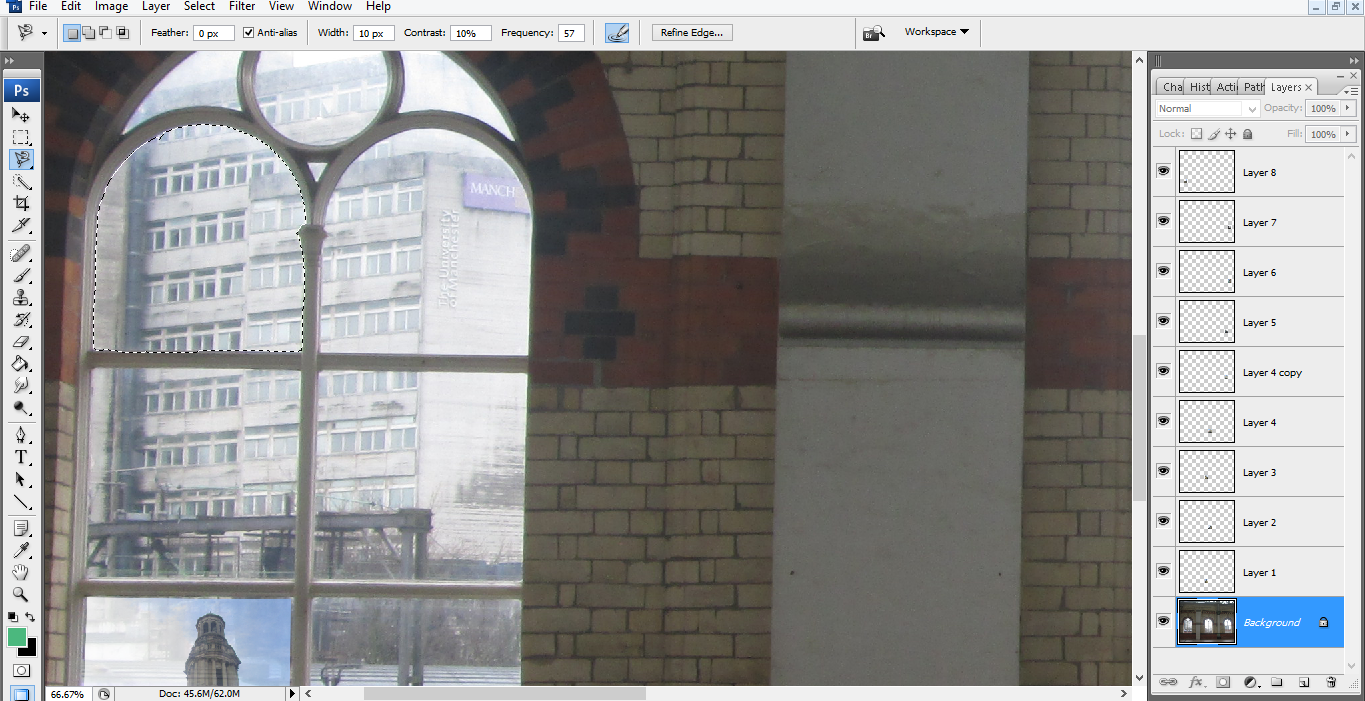
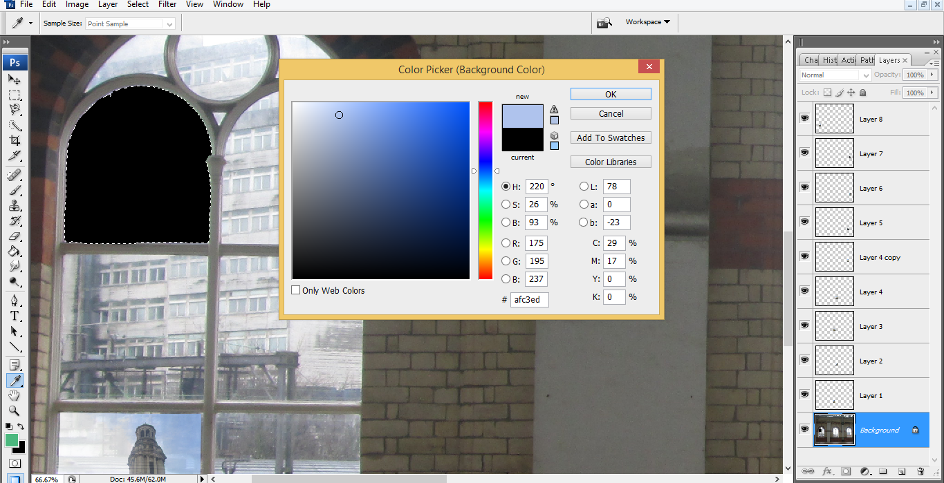
I initially had another idea however unfortunately I lost my work, so I decided to start again with a new improved idea.


This is my editing from when I restarted my work to create my final piece I had in mind.


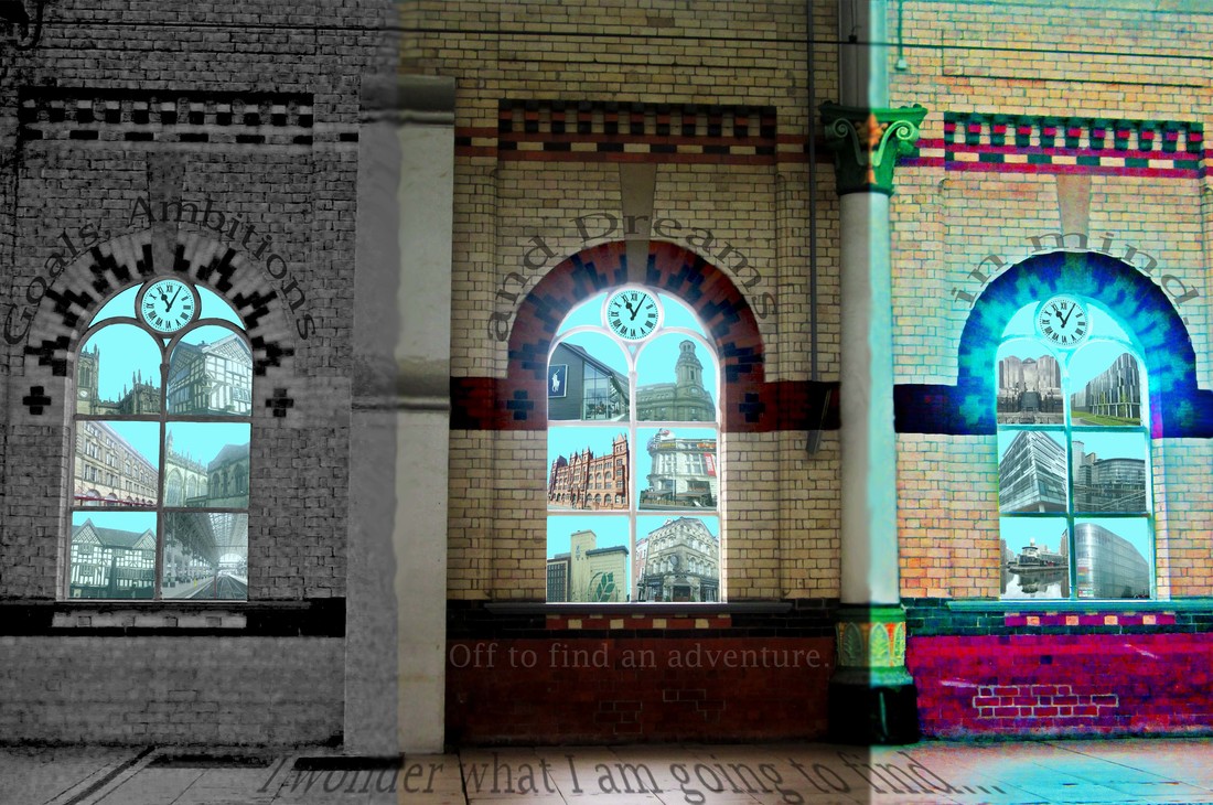
Final Pieces
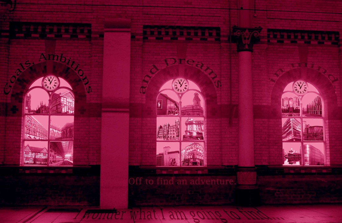
Evaluation
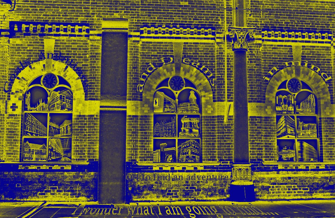
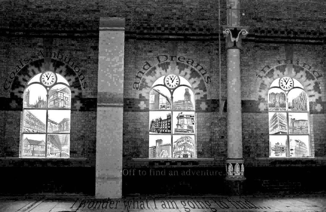
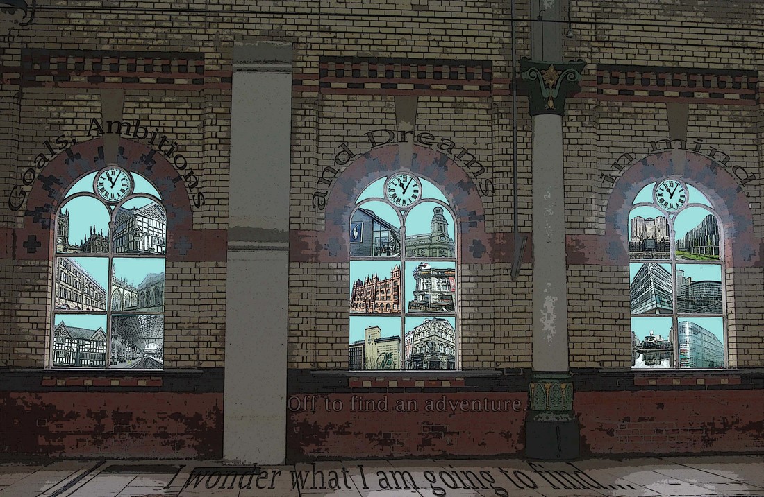
The Colours:
Buildings/Backgrounds:
- Black and White - I chose to use the black and white filter as this would link in with my buildings which were built in the historian times (before the 1800s) this is also because in this period of time there was no coloured photography.
- Subtle/Neutral - As these colours represent the modern day of architecture (1800s - 1970s). During this period of time colour was newly introduced.
- Futuristic/Bright - As this shows how architecture is developing and the colours fit in with the 20th Century.
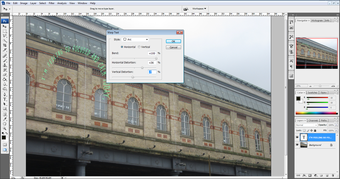
- I have decided to right a short poem about journeys. Here it is:
Buildings/Backgrounds:
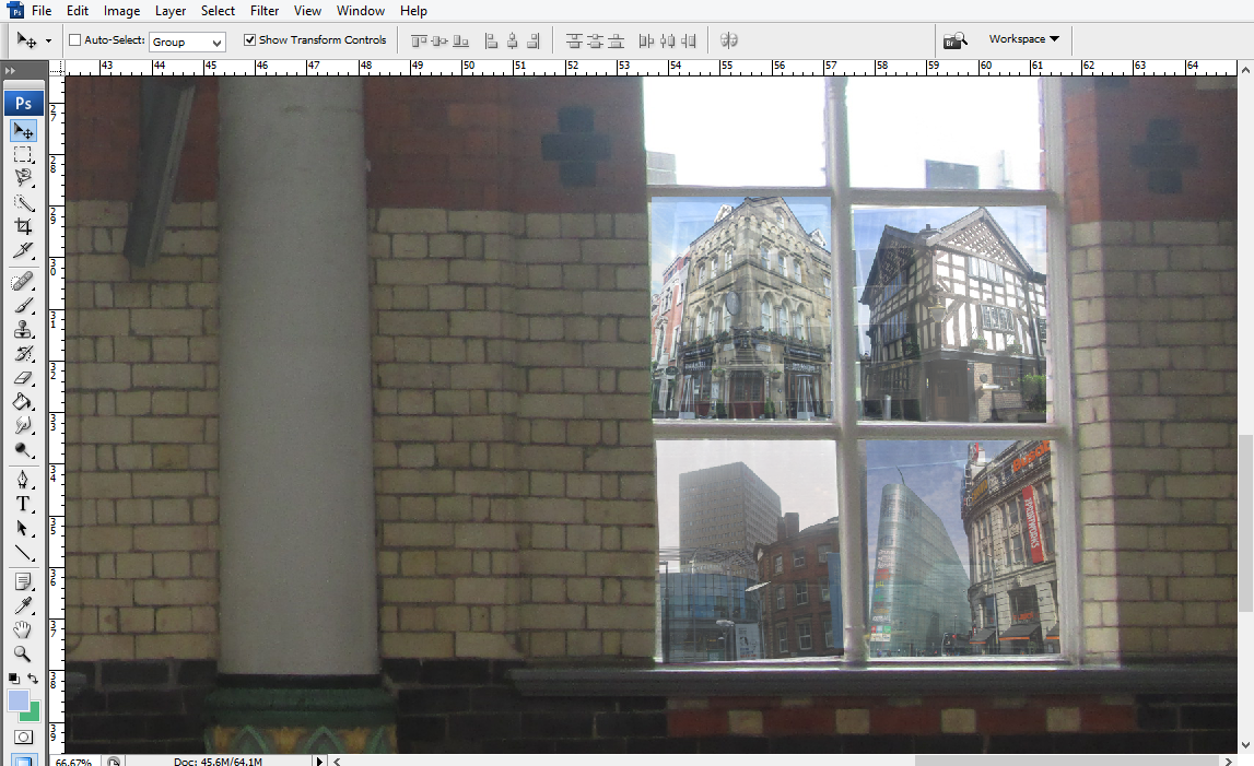
- Background - The background is the interior of the Manchester Piccadilly train station which can also represent how the architecture of Manchester has evolved (the train station being a prime example).
- Buildings - I put my buildings into different categories to then organised them within the 3 different periods of architecture.
- Train Stations (Victoria and Piccadilly) - 1842
- The Old Wellington - 1552
- Manchester Cathedral - 1421
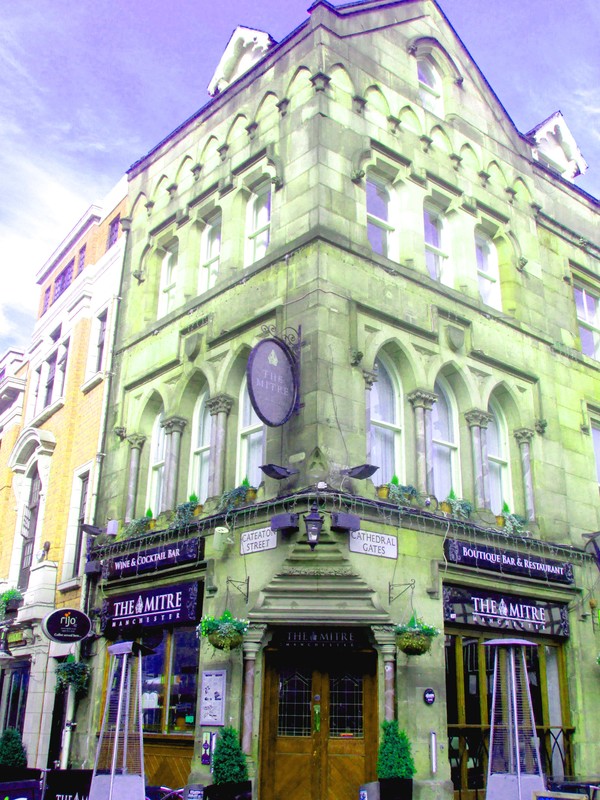
- The Mitre Manchester - 1815
- Printworks - 1873
- Cheshire Oaks - 1995
- The Red Building - 1896
- Rank Hovis - 1907
- The Lowry / Salford Quays - 2000
- Media City - 2011
- Coronation St/ ITV - 2013
- Quay West - 2002
- The Urbis - 2002
