what is campaign photography?
A picture speaks a thousand words, so campaign photography helps people without a voice be heard.
the different Campaigns....

other CAMPAIGNS....

|
This picture represents the campaign of Anti - Racism. The story that the photographer is trying to tell is because of the colour of your skin, your future is already set for you with the type of job you get. The photographer has taken this shot from a birds eye view, to represent that how people are racist to really small children. This photo has a large depth of field as all the babies are in focus. I like how the text used is in different colours. |
|
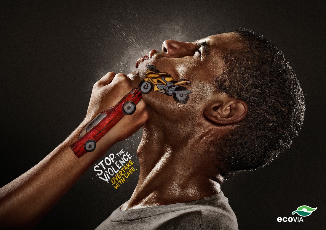
This photo would represent the campaign of Anti- Drink Driving. I like the effect of how the mans being punched in the face and liquid is spraying out, as though it would be the alcohol. The photographer must have used a fast shutter speed to capture that effect. The photographer has also used a spotlight behind them to capture the spraying effect. The photographer has used one sentence in bright colours so that it stands out. |
|
|
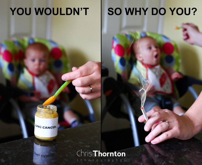
This photo sends the message of Anti- Smoking near babies. In my opinion, the use of text makes the viewer think about They have used a small depth of field to put the front of the picture in focus and then the baby in background is blurred out. Also they have the text very clear, block letters and in capitals, so that it is clear and it stands out. |
My campaign....
My chosen campaign would be anti-bullying, because not only can I express that message but also it leads to other things and is caused by different things so I can link them all together. I think this campaign is a good one to do because many people during school from different ages suffer from bullying and not being accepted for who they are. Some children don't express how they feel or sometimes don't tell anyone about it, making their situation worse.
what is bullying?
There are 3 types of bullying: Verbal, Physical and Social.
Verbal bullying is:
Teasing
Name-calling
Inappropriate sexual comments
Taunting
Threatening
Physical bulling is:
Hitting/kicking/pinching
Spitting
Taking or breaking someone’s things
Making mean or rude hand gestures
Social Bullying is:
Leaving someone out on purpose
Telling other children not to be friends with someone
Spreading rumors about someone
Embarrassing someone in public
Bullying is not always in person, it also tends to happen online. This is known as Cyberbullying, which consists of horrible texts/emails, posting embarrassing videos/pictures, posting rumors of them on social networking sites, and making fake profiles to hurt or get at others. This doesn't become bullying, until it happens several times on purpose.
why do people get bullied?
There are many reasons why children get bullied, and laughed at. The main ones include:
- Not being able to afford branded or the same stuff as everyone else
- Body image, because of either being thought of as fat or skinny
- Racism, for being a different colour and following a different culture
- When one person is more vulnerable than everyone else, for example in a group of boys there might be a weaker one so he'd be picked on
- Homophobia is one of the main reasons because children be finding their identity as they are growing up and sometimes they may be gay, which therefore results to others pick on them
- It can also just be for no reason, as someone or a group of children may feel like picking on other students just because of not liking them or just because they 'felt like it'
cAMPAIGN pOSTERS...


First shoot...
My Plan:
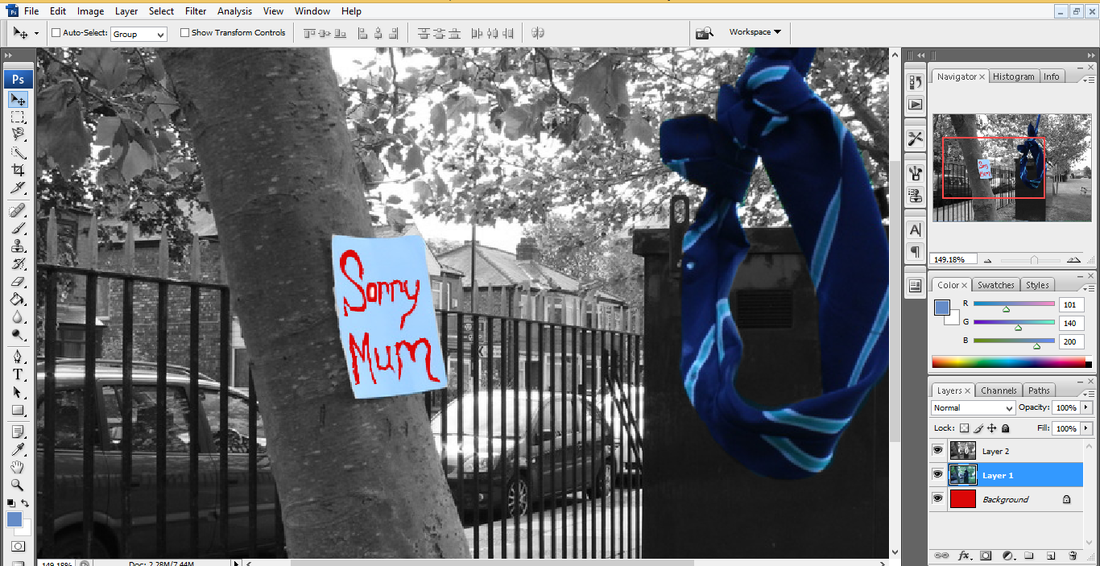
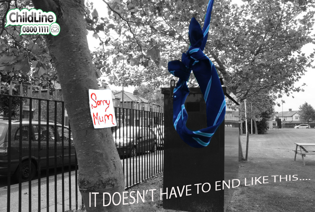
For my first shoot, I will be taking pictures of a tree with the tie hanging on it, and a note stuck to the tree. This note would say 'Sorry Mum', the note will be in focus but the tie hanging on the tree would be blurred. This is to show that a school child for some reason feels that they want to commit suicide but the viewer won't exactly know why this is so, it will make the viewer think why a child at school would want to commit suicide and hopefully they will link it to bullying.
For my first shoot, I will be taking pictures of a tree with the tie hanging on it, and a note stuck to the tree. This note would say 'Sorry Mum', the note will be in focus but the tie hanging on the tree would be blurred. This is to show that a school child for some reason feels that they want to commit suicide but the viewer won't exactly know why this is so, it will make the viewer think why a child at school would want to commit suicide and hopefully they will link it to bullying.


worst pictures...

|
This would have to be my worst picture because I think it's zoomed out too much and you can't really see the note properly. The angle that it's taken from isn't that good either, I think it would have been much better up close.
These two other pictures are also some of my worst ones. As the note is a little over exposed and in the other one I haven't captured the tie at all. |


best picture...
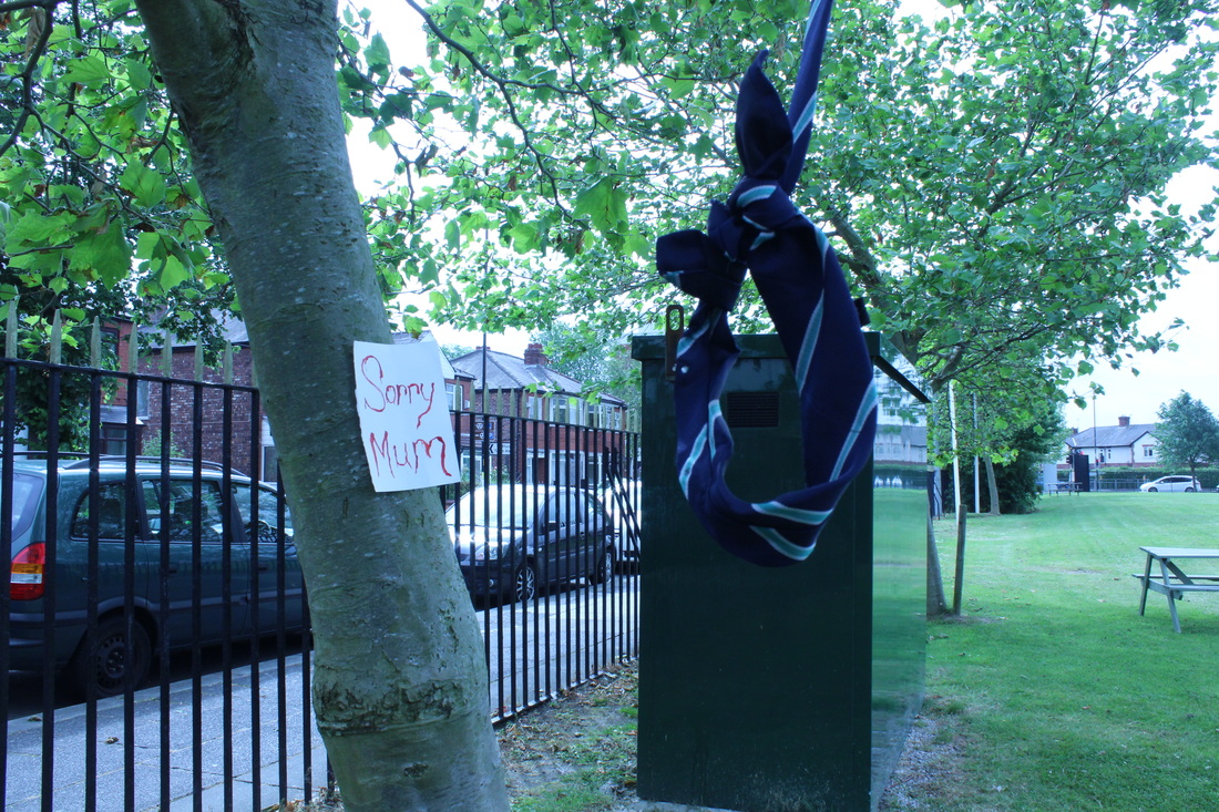
This would have to be my best picture from this shoot because I like how the tie is mainly focused on at the front but you can still see the note beside it on the tree, it's also perfectly exposed as well and in focus. Although this picture could be improved because I have used the incorrect white balance. However, the composition of this photograph is well used. The story behind this picture is that someone at school, so it would be a child is going to commit suicide by hanging themselves with their tie. The note it on the tree as though they have left it their for their mum to say sorry that they have committed suicide. I've decided to not write or give away exactly why they are doing it, so it gives the viewer a sense of thought as they will have to think about why a child might do that and so the question 'Why?' is left with them.
Editing...
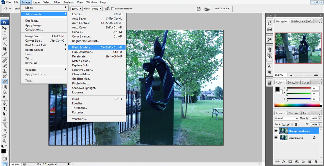
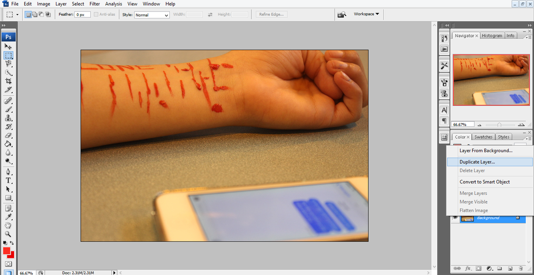
Step 1: Firstly, I had to duplicate the original picture and put it on top of one another. I did this by right clicking on the 1st layer (the original picture) and clicked on 'Duplicate Layer'.
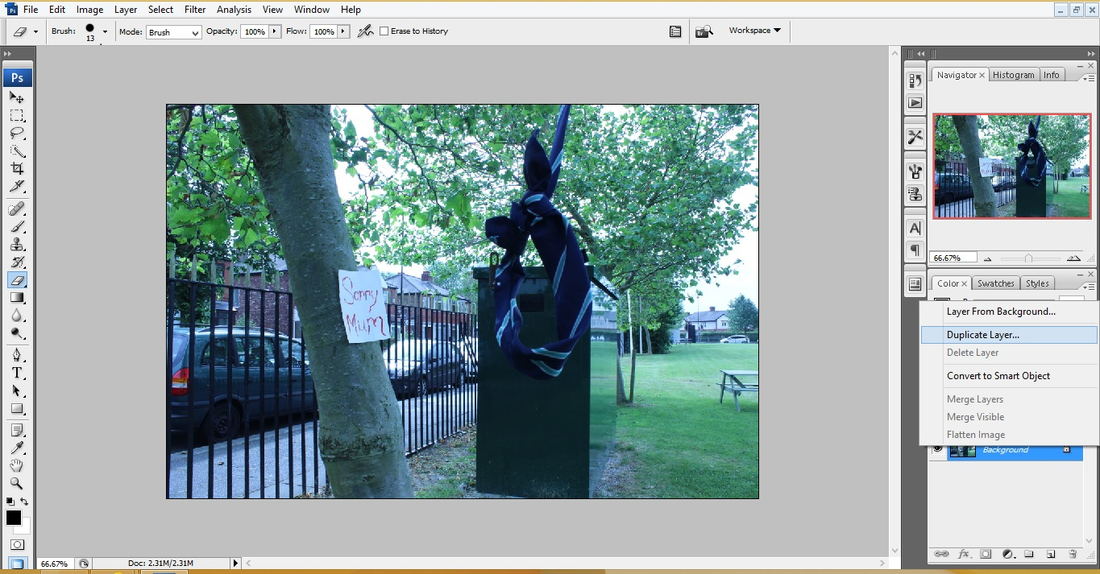
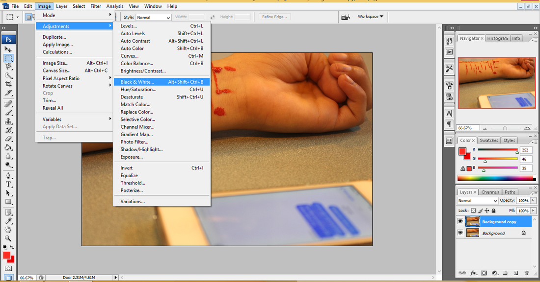
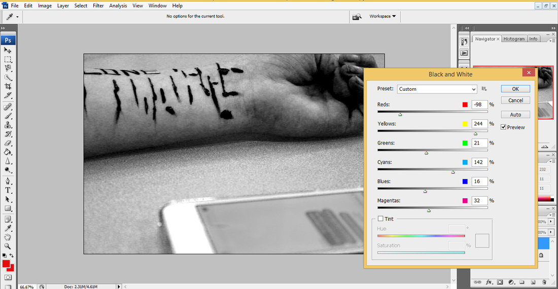
Step 2: Then I have changed the top layer which is duplicated layer to black and white. To do this I had to select it by clicking on 'Background Copy' so I could work on it. Then go to 'Image', 'Adjustments' and to 'Black & White'.
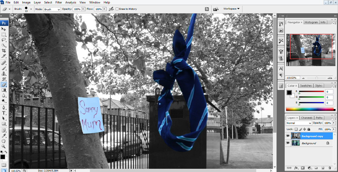
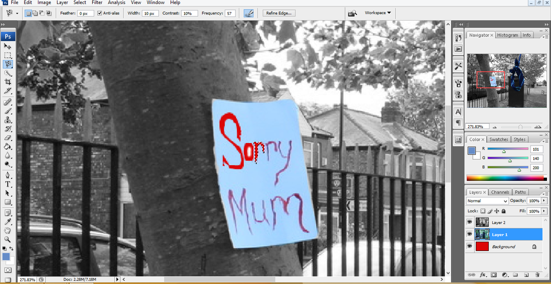
Step 3: I wanted the tie and the note on the tree to be in original colour. To do this I was still working on the duplicated layer. I used the 'Eraser Tool' to the rub off the black and white filter of the note and tie so then the original colour would come through from the layer below (original picture).
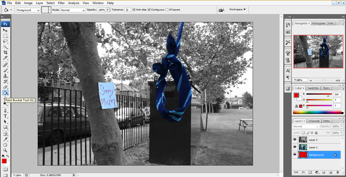
Step 4: I then decided that I wanted the writing on the note to be a brighter red. To do this I firstly had to put my layers onto a clear page, which this would be my 'Background'. Then I used the 'Paint Bucket Tool' and selected the shade of red I required. Then clicked on the background so it would turn that colour.
Step 5: Then I needed for each individual letter to actually become the brighter red. So I used the 'Magnetic Lasso Tool' to cut round each letter on layer 1 (the original photograph).
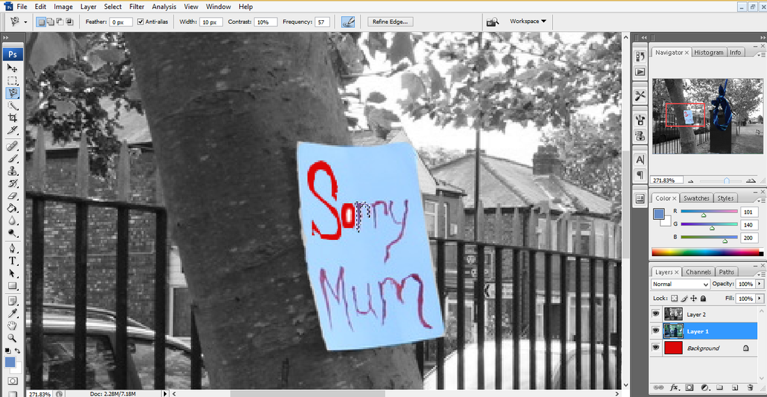
Step 6: Then clicked 'Delete' to remove what I had selected so the red underneath would show as each letter.
Step 7: I had to repeat that for each letter. Eventually, it ended up looking like this as the red background underneath had come through to fill in each letter cut out space.
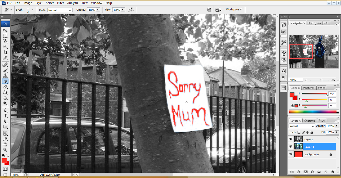
Step 8: Even though the writing on the note was now brighter red, I still wanted the note to be a bit brighter itself to stand out. So I used the 'History Brush Tool' to go around the letters and the paper shape to make it more whiter than I started with it.
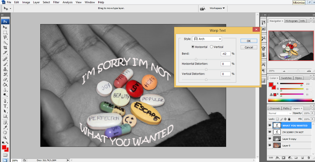
Step 9: Then I decided to add some text to my picture. To do this I used the 'Horizontal Type Tool' and typed what I wanted. Then I didn't want to leave it straight so I clicked on the 'Create Warped Text' icon on the top. I then decided I wanted it to have the effect of 'Rise' so that's what I set it as.
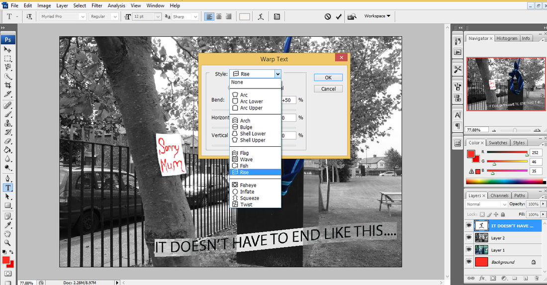
Step 10: I then set the bend and horizontal distortion differently, to make the writing look slightly bigger at the beginning and smaller as it goes off in the distance. I decided to use the colour white for my text, because I didn't want to have it to bright and I wanted it to fit in with the actual picture, since it's mostly black and white.
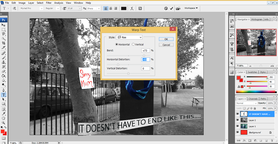
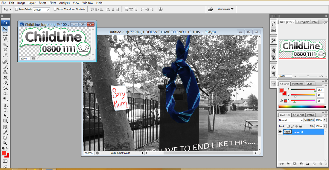
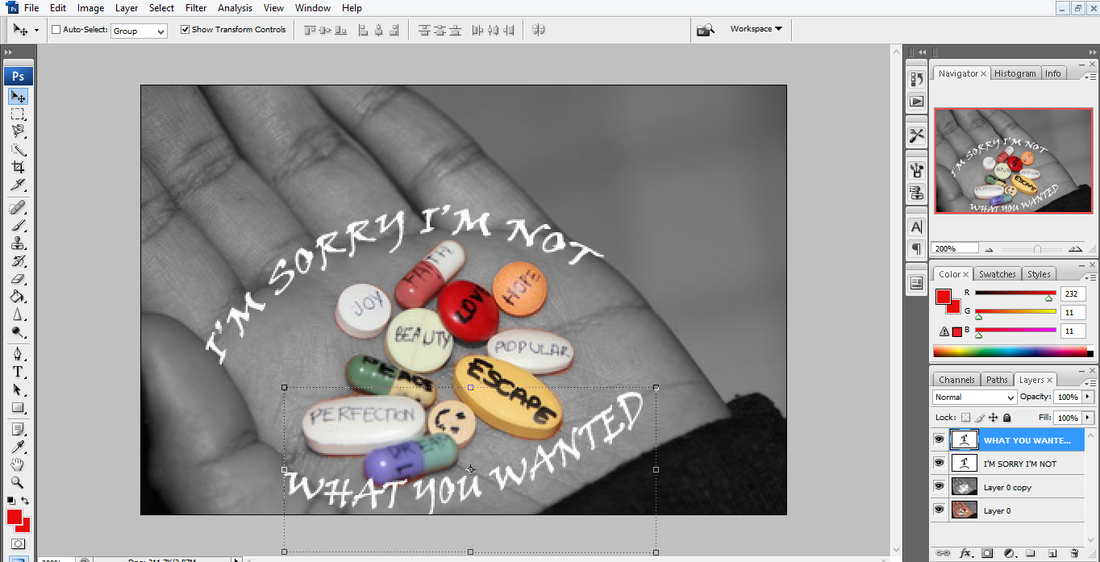
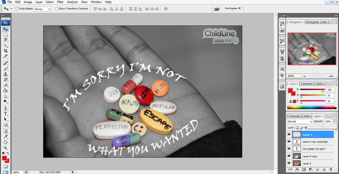
Step 11: Finally, to make my photograph look more professional I decided to add the child line logo. To do this I had to find the picture I wanted and save it. The I went to 'File', 'Open' and selected it. I then dragged it along onto my photograph so I could place it where I wanted. Then to make it smaller I selected 'Show Transform Controls' and resized it. Then placed it in the top corner.
final piece...
Second Shoot...
My Plan:
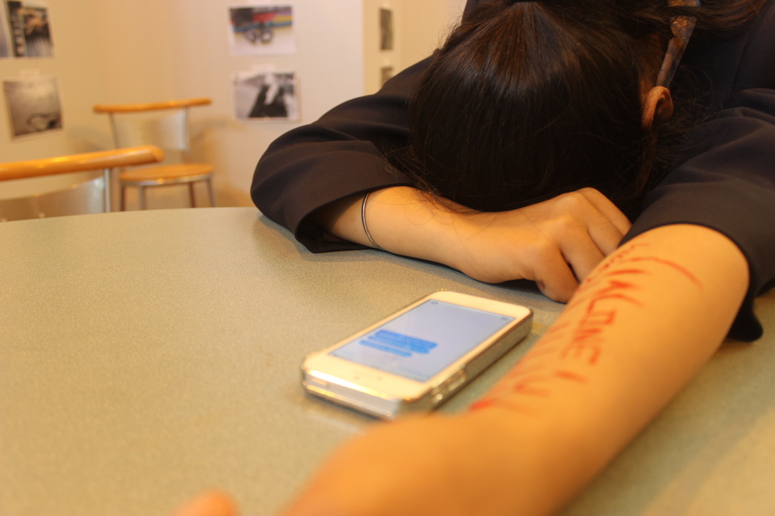
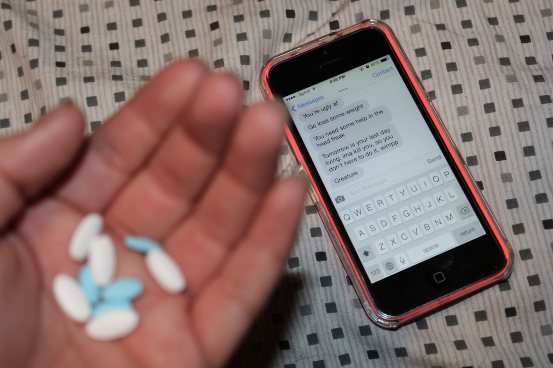
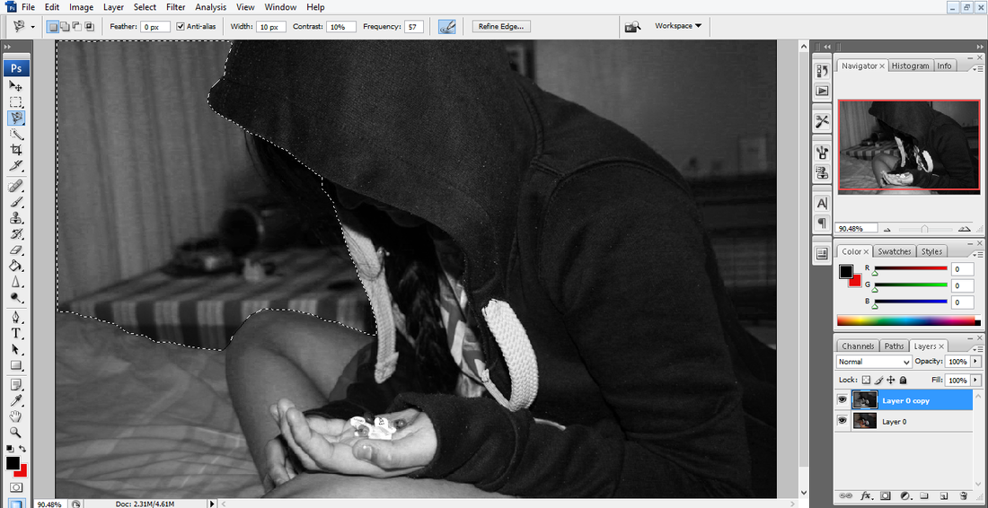
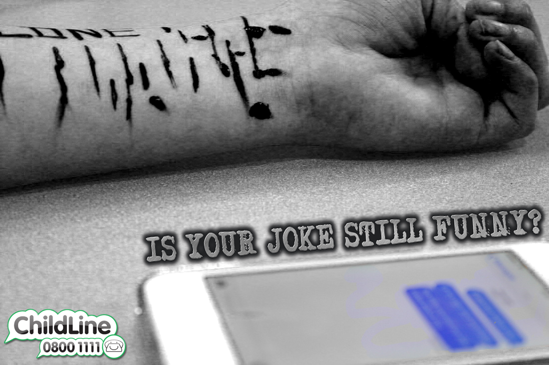
For my second shoot, I have decided to have someone who has self harmed, due to being bullied. I'm going to have them sitting there with a phone in front of them, this would also represent them self harming because of being cyber bullied. On there arm it will say lots a different stuff and have cuts as well. My focus point will be on the phone so you can see the horrible messages that have been sent to them, but their hand will be a little blurred out. The persons head will be down on the desk as though they are sad and upset. I will be taking the picture quite close up and the angle I'd take it from would be from birds eyeview so I can get their hand and the phone messages in the picture, I'd also experiment by taking it from beside them and next then as though they are taking it themselves.
For my second shoot, I have decided to have someone who has self harmed, due to being bullied. I'm going to have them sitting there with a phone in front of them, this would also represent them self harming because of being cyber bullied. On there arm it will say lots a different stuff and have cuts as well. My focus point will be on the phone so you can see the horrible messages that have been sent to them, but their hand will be a little blurred out. The persons head will be down on the desk as though they are sad and upset. I will be taking the picture quite close up and the angle I'd take it from would be from birds eyeview so I can get their hand and the phone messages in the picture, I'd also experiment by taking it from beside them and next then as though they are taking it themselves.


Worst Pictures...
|
Theses would have to be the worst photos of this shoot because they are over exposed. You can't see the messages on the phone so this photograph would be hard to understand and pointless because my focus point wasn't on the phone. Also theses photographs came out quiet blurry.
|


Best Pictures...


Theses are my best pictures from this shoot because I have set my white balance to Tungsten as I was taking my pictures indoors. I changed it to reduce the yellowness of my photographs. The are perfectly exposed and the focus point is in the correct place. I have used a small depth of field of F5 as I have only got the front item in focus whereas the rest of the photograph is blurred out. The only problem with these pictures is, that they haven't followed my plan exactly, as I needed the phone and arm in the same picture to tell the story of cyber bullying not them separately.
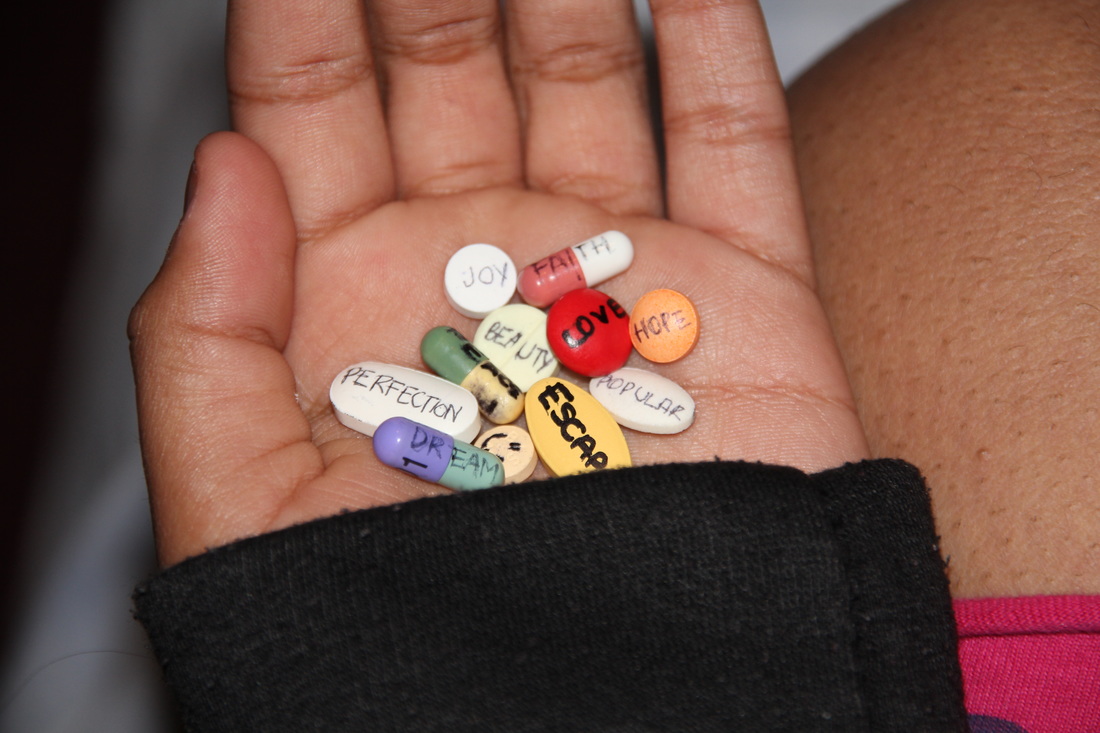
Inspiration
|
I used this picture as inspiration keeping the concept of cyber bullying the same but instead of using pills I had my model as though they had already self harmed. I then edited it further in which made the message much stronger, which you can see the transformation below. |
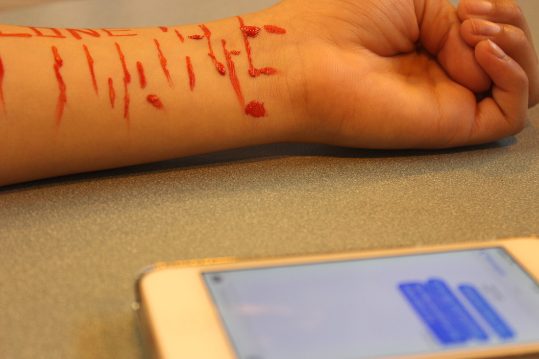
However even though this photograph hasn't got the proper white balance used on it, I still really like how the focus point is on the arm and scars are all bold and look realistic. Also how the phone isn't in focus so the viewer would have to think what exactly do these messages say to make the person self harm. This picture is perfectly exposed and has the depth of field of about F6 as only the item in the middle of the photo is in focus where as everything else is blurred out.
Editing...
Step 1: Firstly, I had to duplicate the original picture and put it on top of one another. I did this by right clicking on the 1st layer (the original picture) and clicked on 'Duplicate Layer'.
Step 2: Then I have changed the top layer which is duplicated layer to black and white. To do this I had to select it by clicking on 'Background Copy' so I could work on it. Then go to 'Image', 'Adjustments' and to 'Black & White'.
Step 3: I decided that I didn't want it just normally black and white, so I decided to customise it. I wanted the blood to be much darker and bolder whilst everything was still black and white.
Step 4: Then I wanted to add text, but instead of using Photoshop I went and created some of a website. I kept it a simple black and white so it'd fit in with the picture. I put a little of a shadow/glow around it so it also stood out.
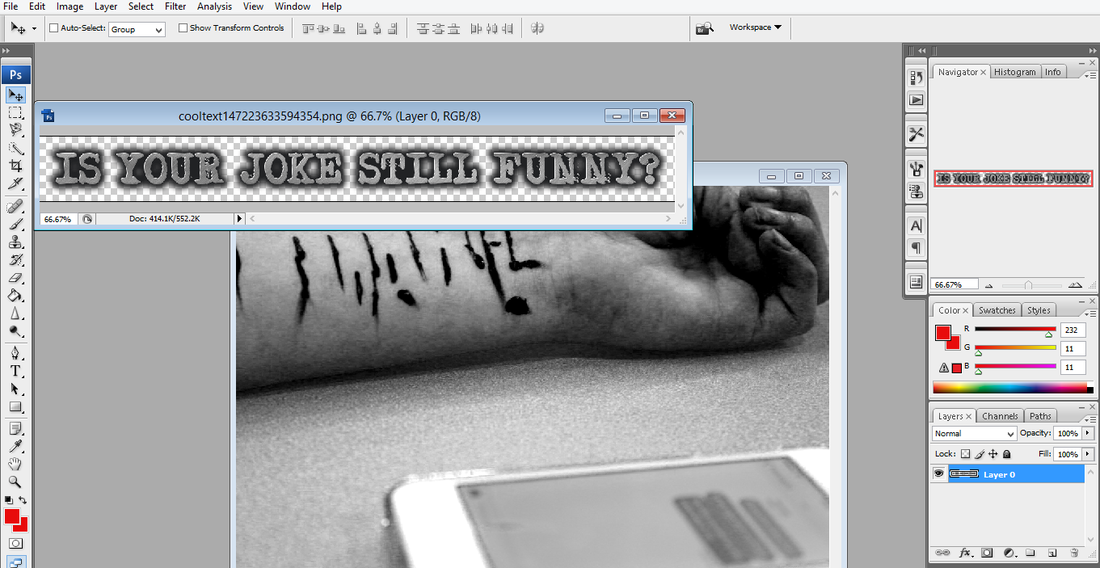
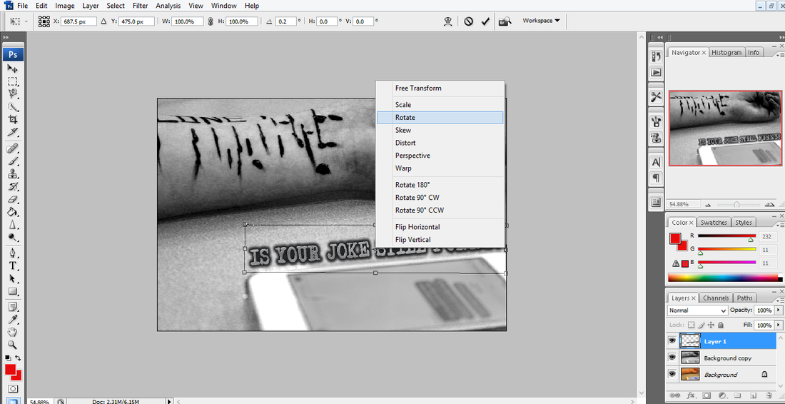
Step 5: The I rotated the text a little so I could place it where I wanted at the angle I needed.
Step 6: Then to make it look more realistic I decided to add the child line logo. To do this I saved the picture from the internet. Then clicked on 'File', 'Open' and chose the picture I had saved. Then I dragged it onto my edited photo.
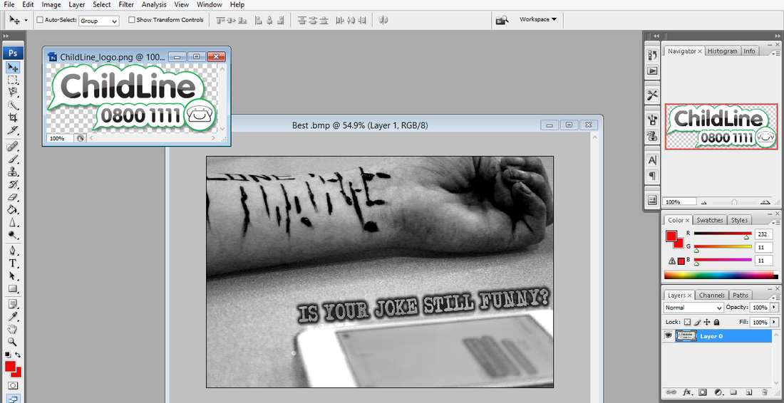
Step 7: Then I had to place the logo where I wanted. Which I chose the bottom corner to make my photography look like a realistic campaign poster.
final Piece....

third shoot...
Plan:
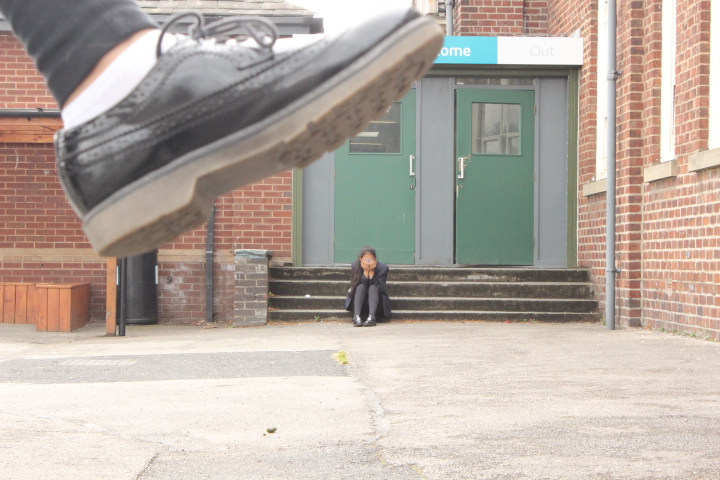
For this shoot I have planned to use perspective photography, in this case it will be someones foot as though they are stomping on the person who will be on the floor. The foot will be big to show how that person is being the bully and the person on the floor will be tiny to show how they are alone and made to feel small and vulnerable when being bullied. I plan to have my exposure perfect meaning it will not be too dark or light. The focus point will be on the person on the floor as they are the victim. The white balance will be on daylight as I will be taking the picture outside. My depth of field will be on F15 as I want the person and foot in focus but the background blurred out.
For this shoot I have planned to use perspective photography, in this case it will be someones foot as though they are stomping on the person who will be on the floor. The foot will be big to show how that person is being the bully and the person on the floor will be tiny to show how they are alone and made to feel small and vulnerable when being bullied. I plan to have my exposure perfect meaning it will not be too dark or light. The focus point will be on the person on the floor as they are the victim. The white balance will be on daylight as I will be taking the picture outside. My depth of field will be on F15 as I want the person and foot in focus but the background blurred out.
Attempt One....
Firstly I tried to do it so that the person that was mean to be alone and getting bullied at the front but that didn't work out. As the person who was meant to be 'crushing' them was behind them meaning their foot was smaller than the person and it didn't look right. The story that I wanted to tell wasn't being told as they were the wrong way round.


Successful Attempt....


Worst Pictures....
|
Theses would have to be the worst pictures of this shoot due to the fact that the persons foot is in the wrong place, as its somewhere else but above the other persons head. Also the foot is slightly blurred as it's moved whilst taking the picture.
|


best picture....

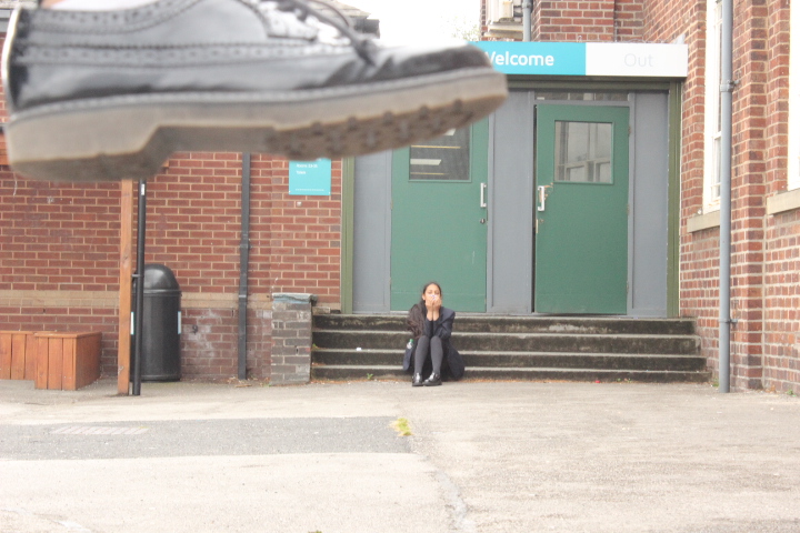
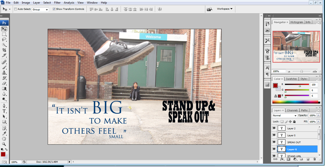
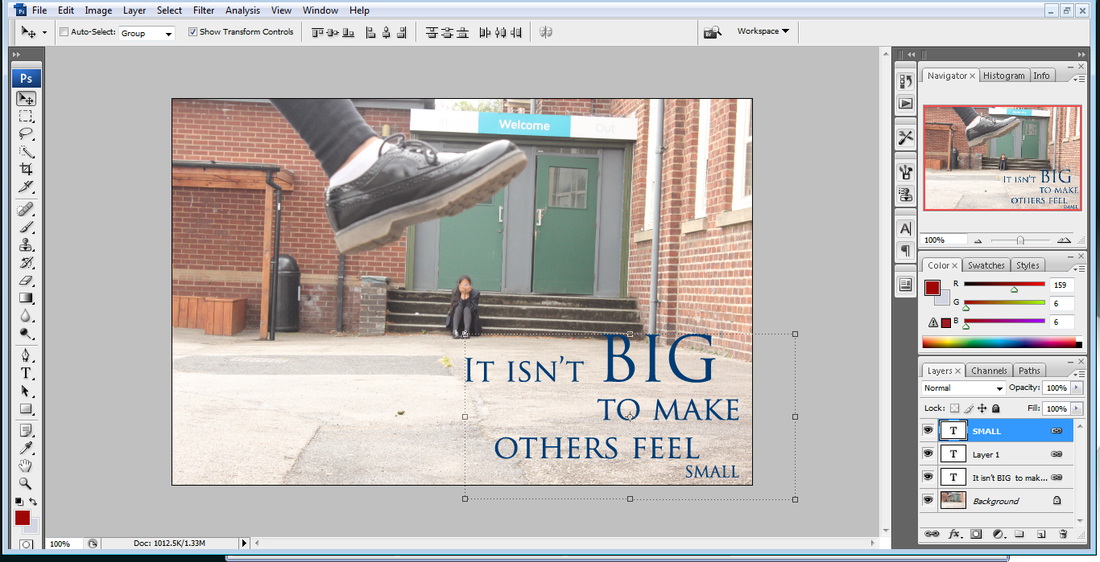
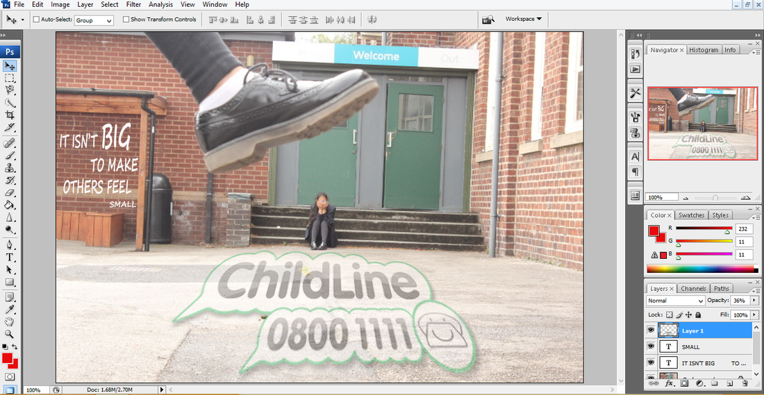
This has to be the best picture from this shoot because it tells the exact story that I planned for it to tell. It's perfectly exposed, the white balance was set to cloudy because on the day that I took this shoot it was quiet cloudy and dull outside. Also the depth of field is how I planned which is set as F15, which made the girl and the foot in focus. My focus point was on the actual girl though as she was the main focus of this shoot. They story that I've planned to tell has been told perfectly because the girl looks small, scared and alone, whilst being bullied and as though she's being stomped on by the bully.
Editing...
Step 1: For this photograph I wanted to just add text. So I found the quote that I wanted and added the text. I made it different sizes and changed the layout of it all.
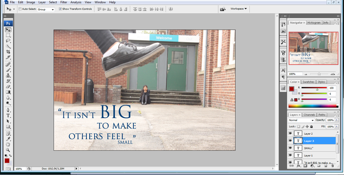
Step 2: I was going to add some more text to go on the photo but that didn't really suit my theme of photo.
Step 3: Then I moved it around to different places to decode where it looked best.
Step 4: Then I decided to make the writing white and put it smaller on the wall. This was so it looked as though someone had wrote it on there with chalk. Also instead of just putting the child line logo in one of the corners I decided to make that apart of the picture as well.
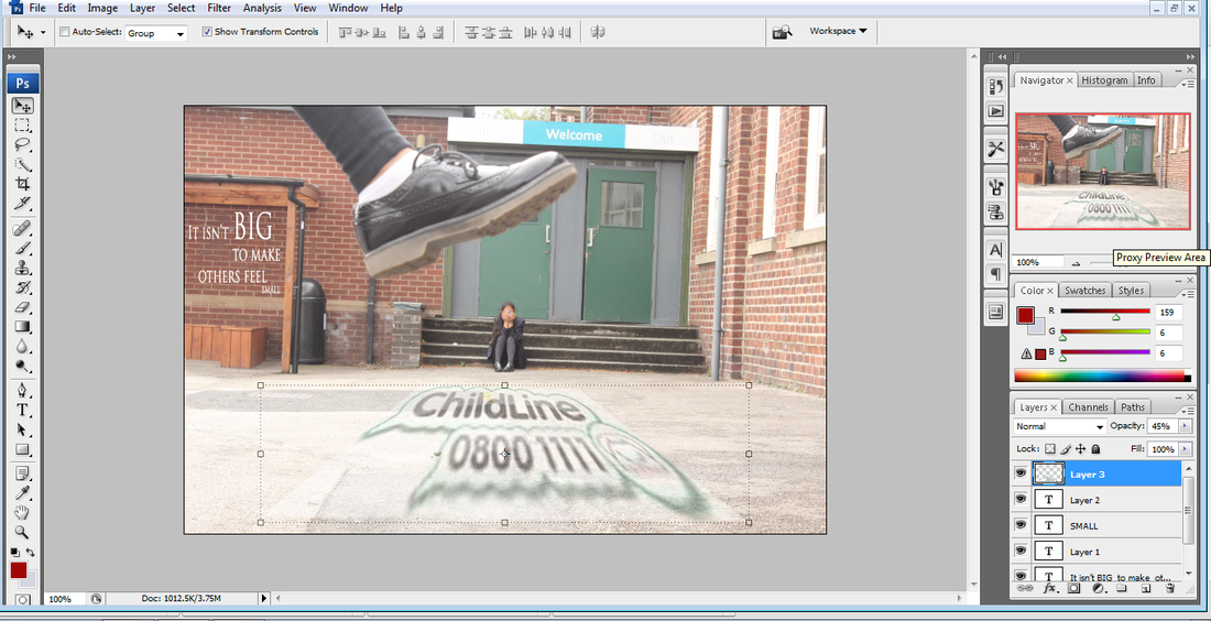
Step 5: I then changed to font of my text to make it look more realistic. I found another child logo as the other one had a background which was a little visible. Then I used the perspective to make it look as thought it was actually painted onto the floor.
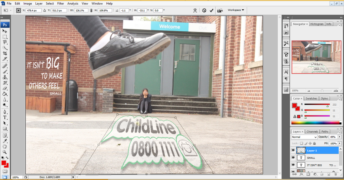
Step 6: I then decided to slightly change the size of the text and make the 'BIG' much bigger and all the other words a little smaller, so that it stood out a little better. Then I straightened up the child line logo and changed the opacity to make it look little faded on the ground.
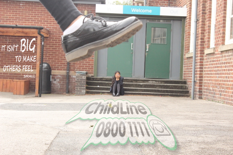
Inspiration:

|
I have used the way the text is wrote in this picture as a simila
|
Final Piece...
Fourth shoot...
The Plan:
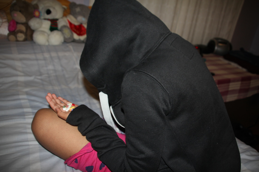
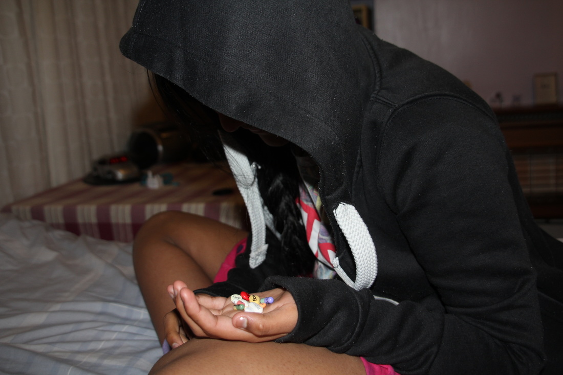
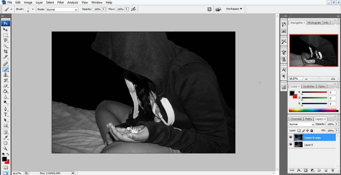
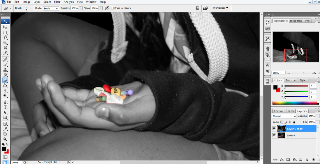
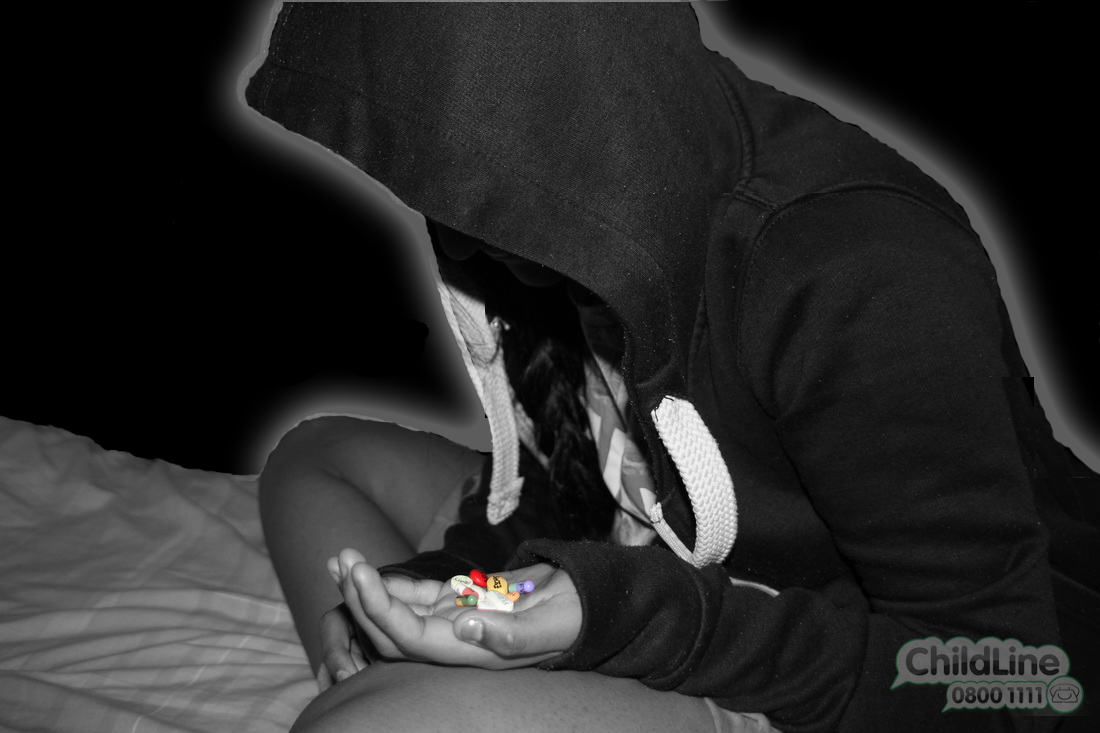
For this shoot, I've decided to write lots of different words on the tablets for someone to hold. The person will be wearing a black hoodie with the hood up and sat on a bed facing the other way. They will also be lying down in some photos with the tablets beside them or in their hand. The exposure will be perfect so it's not too dark or light. I want my focus point on the tablets. My depth of field will be medium as I want the front and background blurred out, therefore I'd need to use an aperture of F16. The white balance will be set to Tungsten, as I'll be taking the photographs indoors. The story I'm hoping to create is that this child is going to eat the tablets because they desire the words on them.
For this shoot, I've decided to write lots of different words on the tablets for someone to hold. The person will be wearing a black hoodie with the hood up and sat on a bed facing the other way. They will also be lying down in some photos with the tablets beside them or in their hand. The exposure will be perfect so it's not too dark or light. I want my focus point on the tablets. My depth of field will be medium as I want the front and background blurred out, therefore I'd need to use an aperture of F16. The white balance will be set to Tungsten, as I'll be taking the photographs indoors. The story I'm hoping to create is that this child is going to eat the tablets because they desire the words on them.


Worst Pictures....

|
These would have to be the worst photos from this shoot because they are all blurry as my focus point was not set correctly. Also my aperture is too small as I should have used F16 so I e got the tablets in focus making it a great picture. Also one of them are slightly over exposed, so they have come out too light.
|


best pictures....


These would have to be my best photos from this shoot because my focus point is set correctly. I really like how they are a little under exposed as it gives it more effect as then there is only light on the person and the tablets. The atmosphere looks gloomy which I think brings out the fact that the person is lonely and depressed. Also my depth of field is medium as my aperture was F14 so the background and surrounding of the person are blurred out. The only thing I'd improve about these pictures is that you can't actually see the words on the tablets properly, instead you can only see some of the letters on them. In a way this would show that there is something written on them and that the viewer would have the thought of what they say.
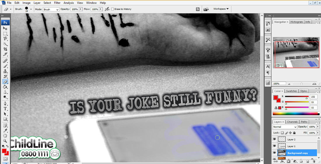
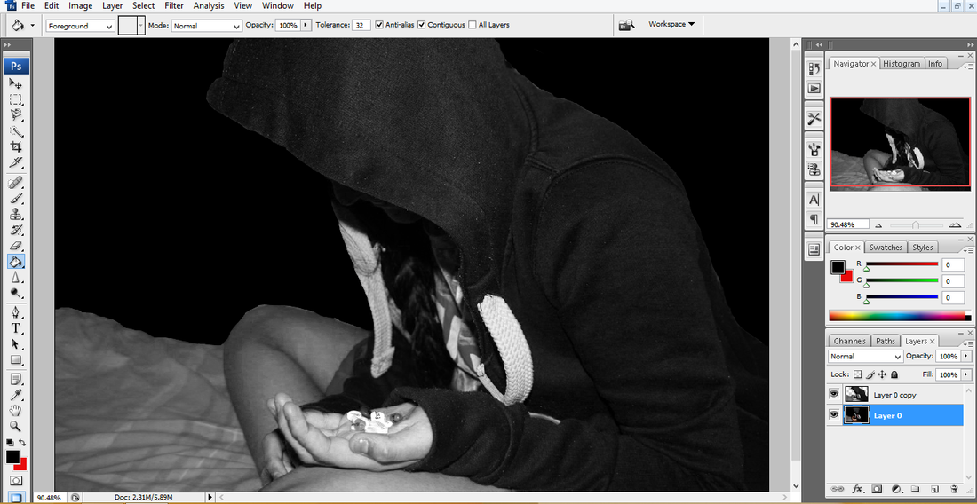
Editing... (Picture 1)
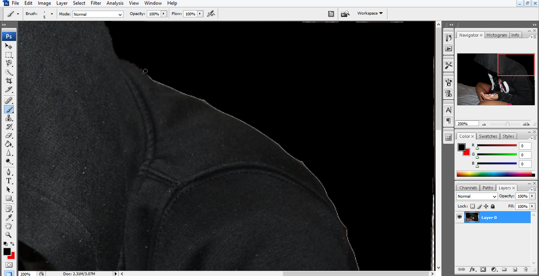
Step 1: First I duplicated my picture, by right clicking on the layer and selecting 'Duplicate Layer'. Then I made it black and white by going on 'Image', 'Adjustments' and clicking on 'Black & White'.
Step 2: Using the 'Eraser' tool I rubbed off the black and white effect off the tablets so that they were their original colour.
Step 3: I then wanted to add text, so I created some on the "Cool Text Generator". Then placed it along the hand, I had to rotate it and resize it.
Step 4: However I didn't like that text as it didn't really go with my theme of picture. So, then I decided to choose a different style of text and then give it an arch and bend.
Step 5: I then decided that the style of text didn't fit in with my photo so I decided to change it again. Then I also decided to place it different, as I wanted it to be against her hand bends.
Step 6: I then added a child line logo to it to make it seem like a real poster. Instead of keeping it the original boldness, I decided to change the opacity so it seemed a little faded and fitted in a little better with my photo.
final piece...

Although I prefer it much better without the writing as it sends a much stronger message.

Editing.... (Picture 2)
Step 1: First I duplicated my photograph and turned it into black and white. To do this I went on 'Image', 'Adjustments' and then 'Black & White'.
Step 2: I used the 'Magnetic Lasso Tool' to cut out the part of background I didn't want anymore. On the original picture and duplicated version.
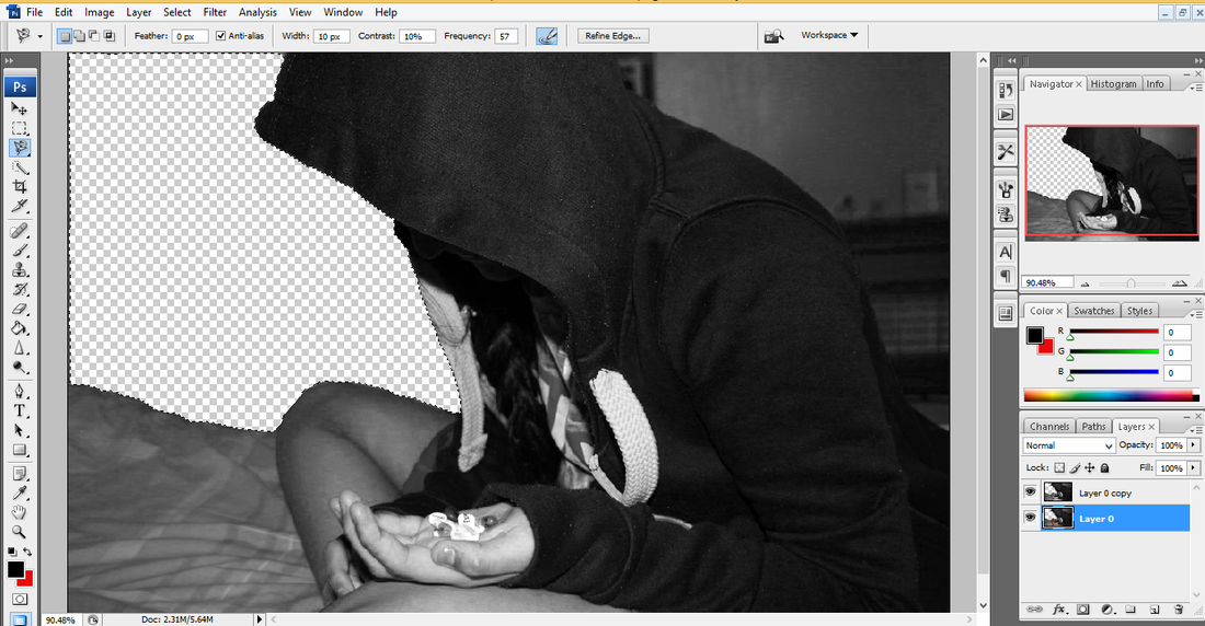
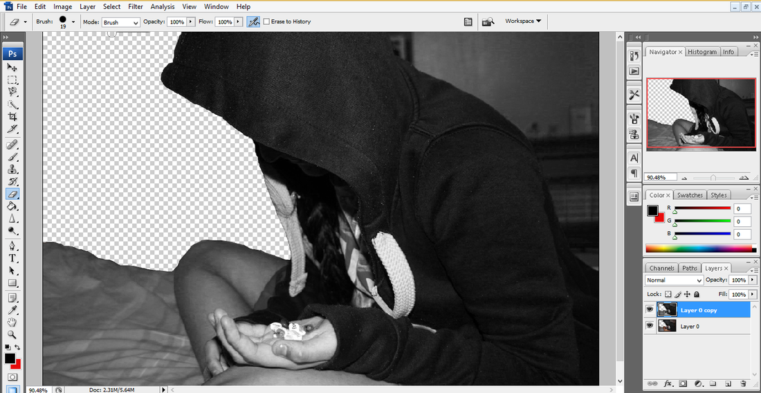
Step 3: Then I used the 'Eraser' to tidy it up.
Step 4: I repeated it again to the other side of the photograph, using the 'Magnetic Lasso Tool'. Then deleted it of both layers.

Step 5: I then again I used the 'Eraser' tool to tidy up the parts that weren't deleted.
Step 6: After tidying everything up and making sure the outline of the person was straight and cleaned up.
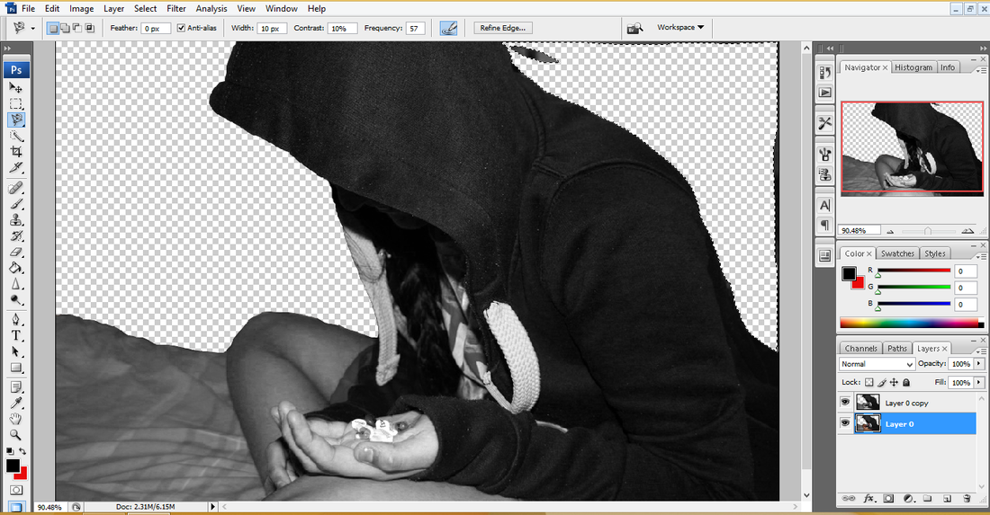
Step 7: I then changed the background into black. To do this I chose my colour black, then selected the 'Paint Bucket'.
Step 8: I then had to zoom in and use the 'Eraser' tool to rub out the outline that was left around the person.
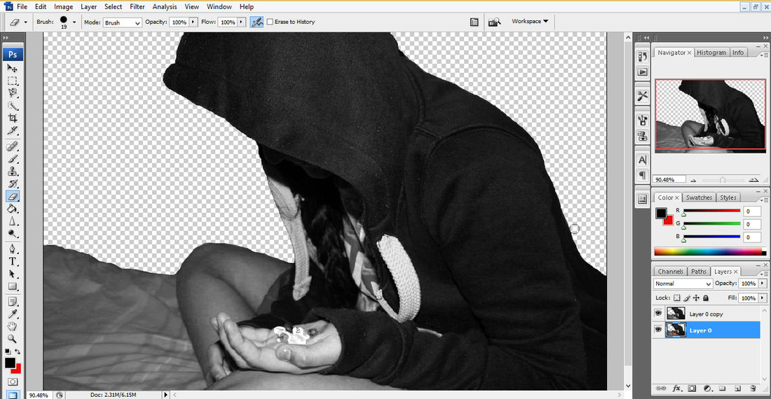
Step 9: After doing that, it looked much sharper and tidier.
Step 10: I decided to have the tablets in colour so their were a little noticeable as the rest of the photograph would be in black and white.
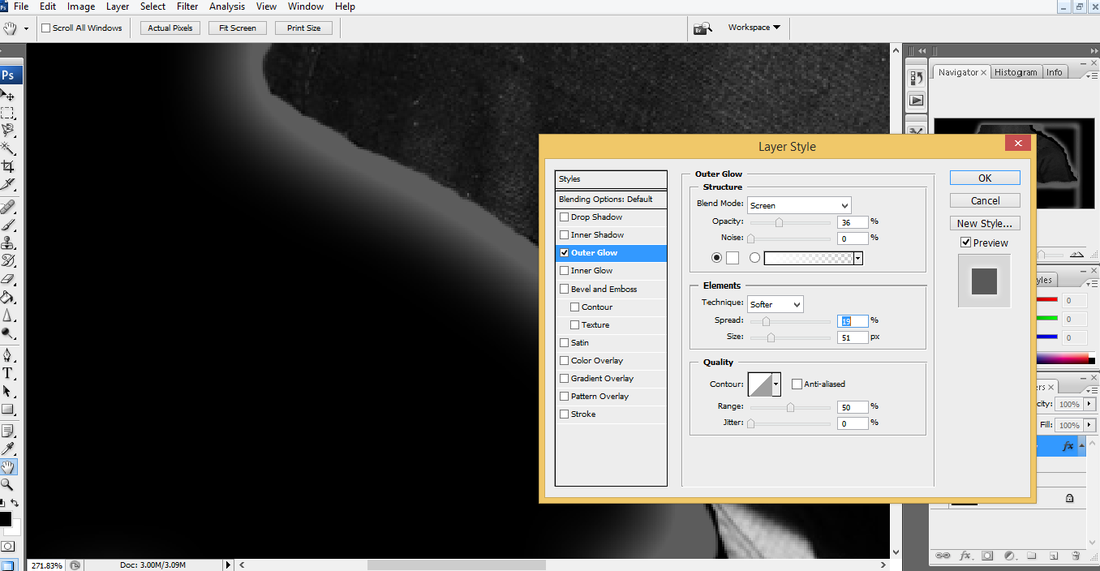
Step 11: I then wanted to have the person stand out a little more, so I decided to add a outer glow around it. I chose it to be the colour white. To do this I had to double click on the layer and then just customized it to how I liked.
Step 12: I then added text to the photograph, I put effects on it to make it seem faded away and rotated it.
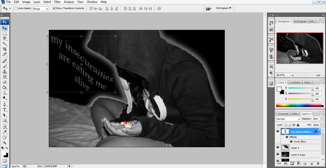
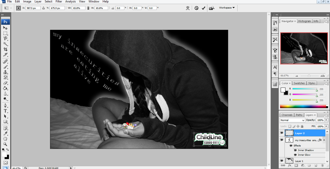
Step 13: I changed the text to make it fit in with my photo a bit more. I gave it the effect of the 'Wave' and then customized it to make it seem as though it flowed. I also added a child line logo so that my photograph seemed more realistic like a campaign poster.
Final Piece....
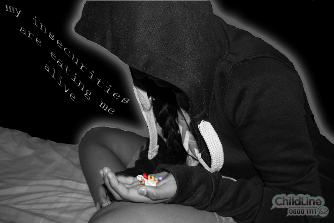
Although in my opinion I prefer it much better without any text as it sends a much stronger message out.
Wall of the Greatest...


My EVALUATION...
To evaluate, during this unit I have improved my techniques as now I'm adjusting white balance settings when taking a picture inside to alter the colour, for example tungsten will apply a blue filter to the image removing the yellow tones. I have also learnt how to use Photoshop really well and the difference that it can make to your pictures. The black and white filter on my photographs creates more contrast, this helps to make them stronger. I understand the effects of how applying the correct font can play such an important part in a poster, however sometimes your photograph is powerful enough without words as a picture speaks a thousand words! After doing Campaign Photography, I know how photographers send and give a message just through a picture with just a sentence or no text on. To extend this task further I would investigate other campaigns and continue to explore the Photoshop program. I am intrigued by investigating the possibilities that Photoshop can introduce to my photography and allow me to edit my pictures to a high level sometimes bending the rules of normality.
